
Stanley Ojima
Senior Product Designer · B2B SaaS and enterprise products
Senior product designer with 8+ years designing B2B SaaS and enterprise products across HR, fintech, health and logistics. I take dense, high-stakes workflows and make them predictable, and I measure the work by what it changes. At GoCo (acquired by Intuit), rebuilding Reports cut support tickets by 30% and lifted monthly usage from 28% to 52%.
Experience
QuickFleet (quickfleet.co), Co-founder & CTO
2026 – Present
- Own product and technology. Defined booking, fixed pricing, dispatch, live tracking and proof of delivery as one system.
- Designed the customer app end to end, including a four-digit delivery code receivers confirm from a text link, with no app to install.
- Designed and built the marketing site and waitlist at quickfleet.co.
- Proposed the battery-swap partnership that makes fixed, pump-independent pricing viable.
GoCo (goco.io), Senior Product Designer
July 2022 – April 2025
- Rebuilt Reports, the platform’s largest source of support tickets, into a three-step flow with live preview and smart defaults: support tickets down 30%, monthly usage up from 28% to 52%, report creation 2.2× faster.
- Designed across 10+ product areas, including employee profiles, scheduling, workflows, time off and payroll; the new scheduling flow cut weekly scheduling from 45 to 15 minutes.
- Built GoCo’s design system: 120+ components and tokens adopted across 12+ product modules, cutting design-to-development handoff time by 35%.
- With the Director of Design, introduced weekly critiques of work in progress, research before design, and a standard handoff format.
- Contributed to a 60% increase in customer satisfaction following the platform redesign.
Curva Digital (curvadigital.co.uk), Senior Product Designer
February 2020 – July 2022
- Owned design execution across mobile apps, websites and visual systems for multiple clients, from early concepts through high-fidelity UI and delivery.
- Translated ambiguous client briefs into clear, user-focused solutions tied to business goals.
- Balanced speed, quality and stakeholder expectations across concurrent client projects.
DRO Health (drohealth.com), Product Designer
November 2019 – February 2021
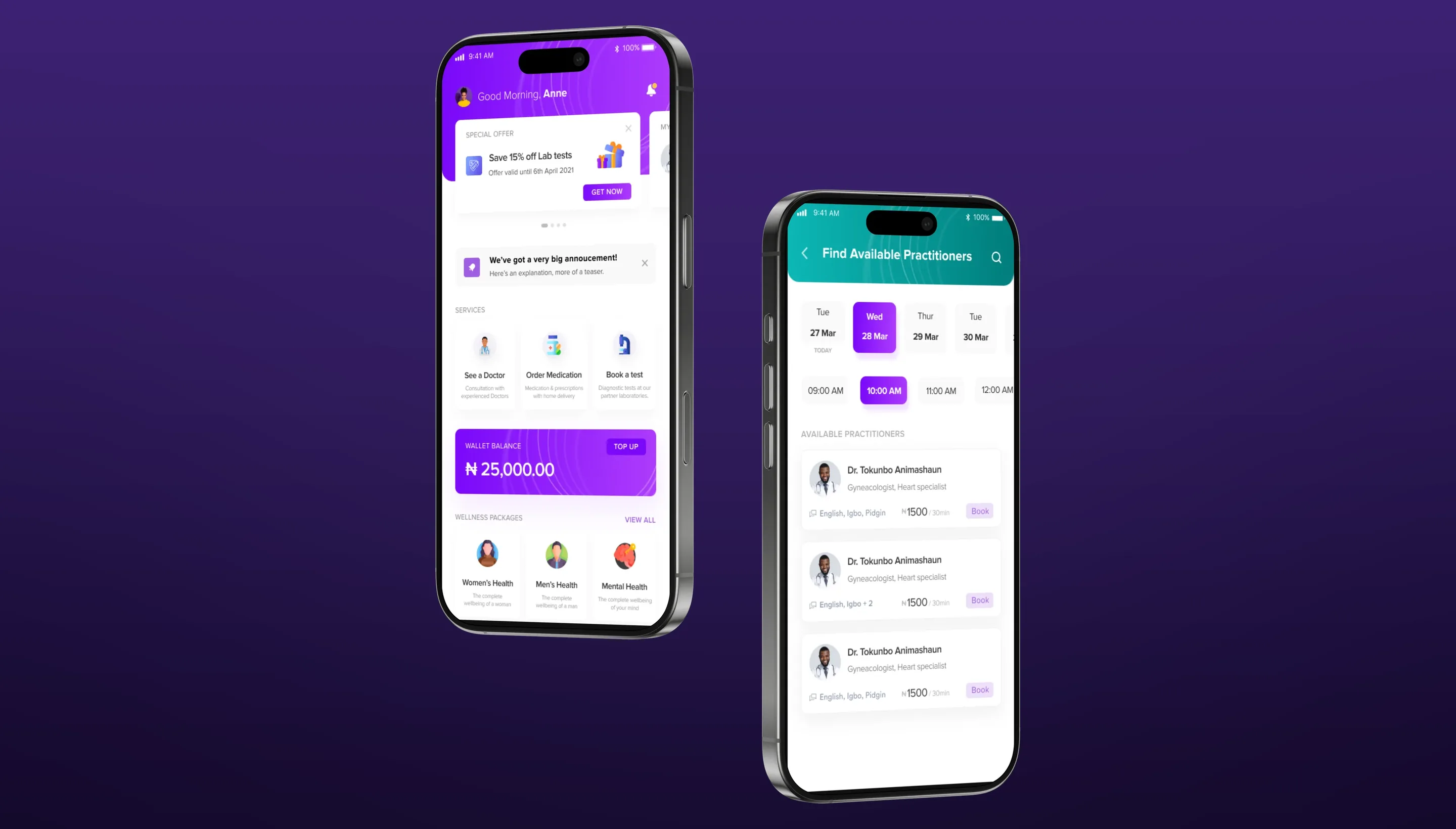
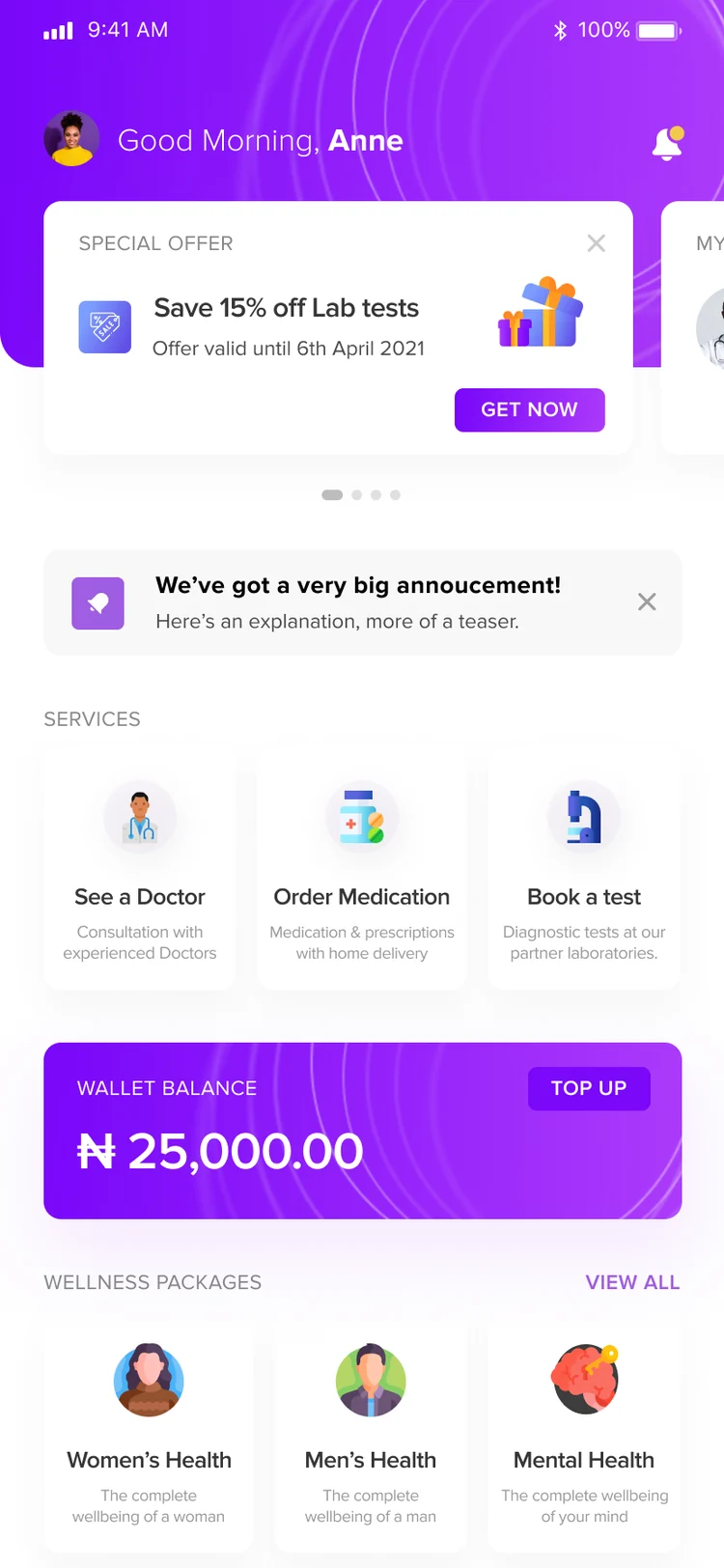
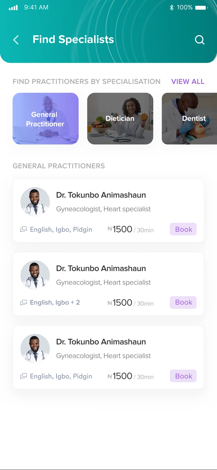
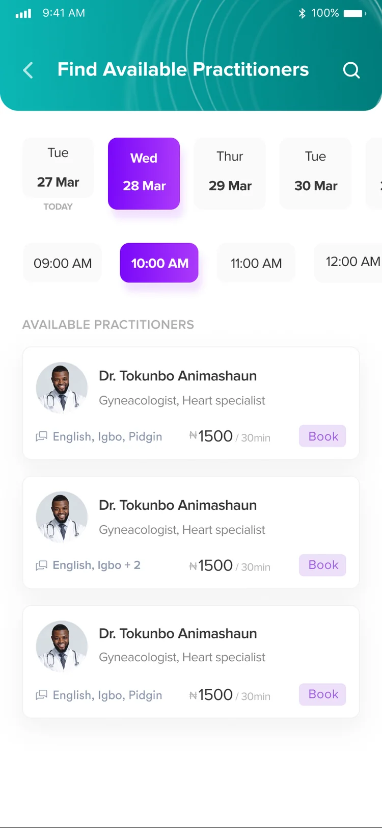
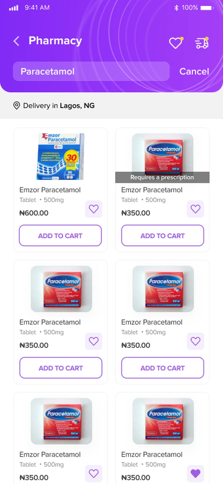
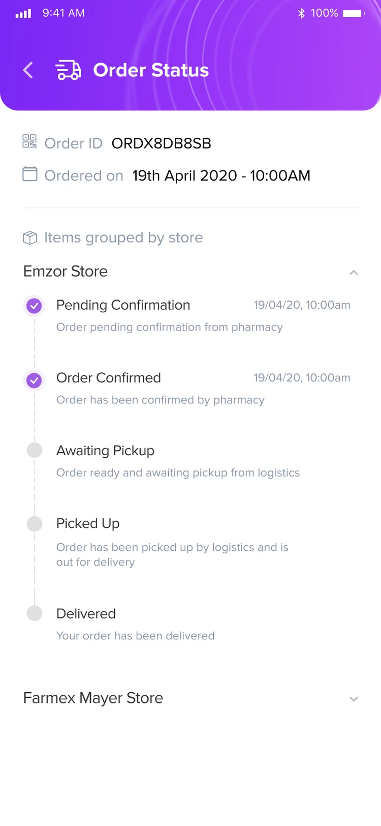
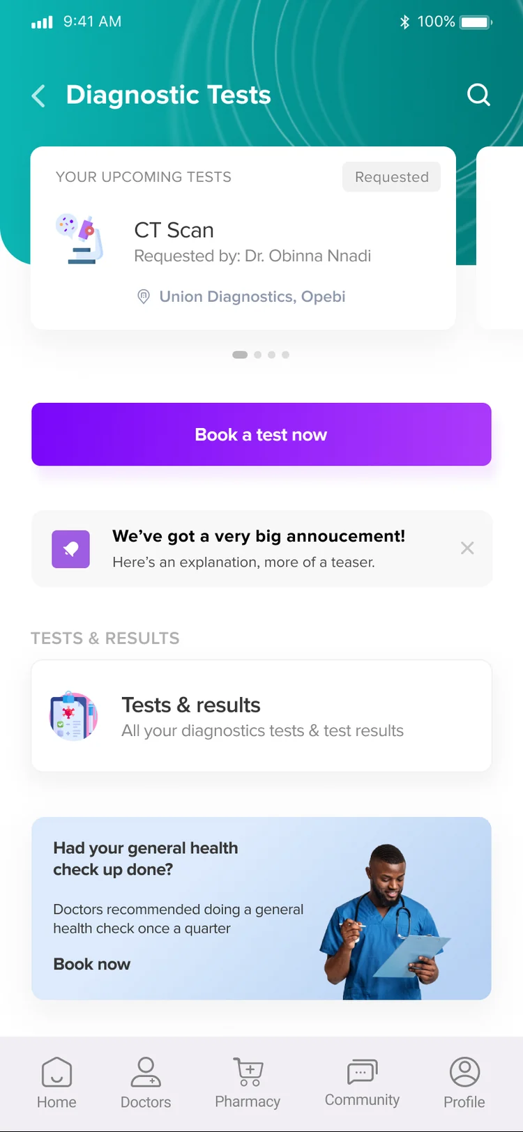
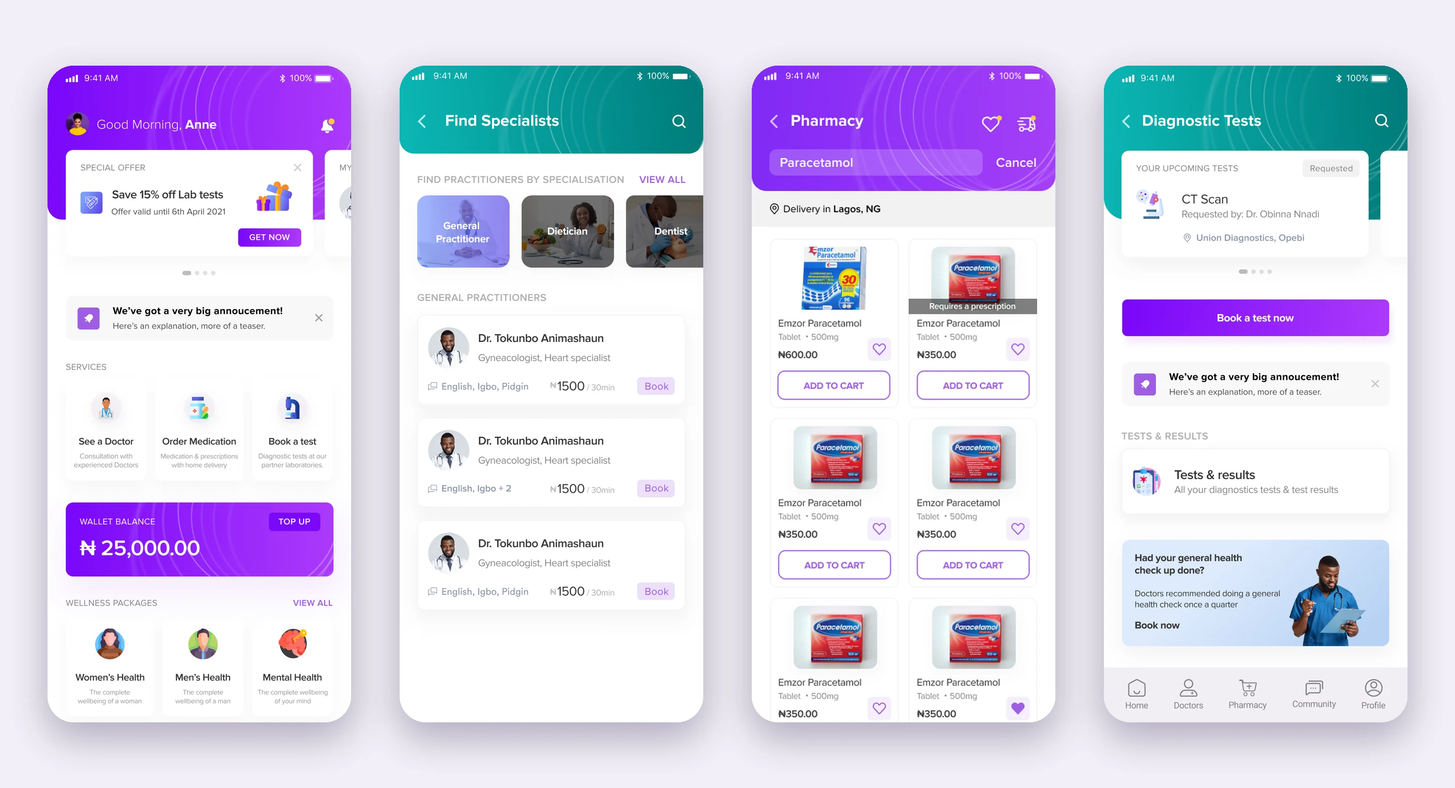
- Restructured the app around its three primary intents (see a doctor, order medication, book a test); users could go from opening the app to booking in under a minute.
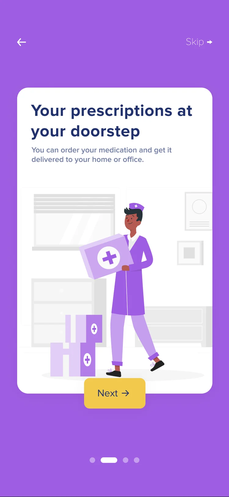
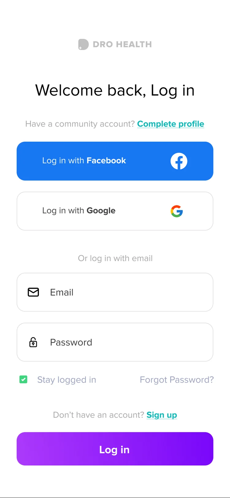
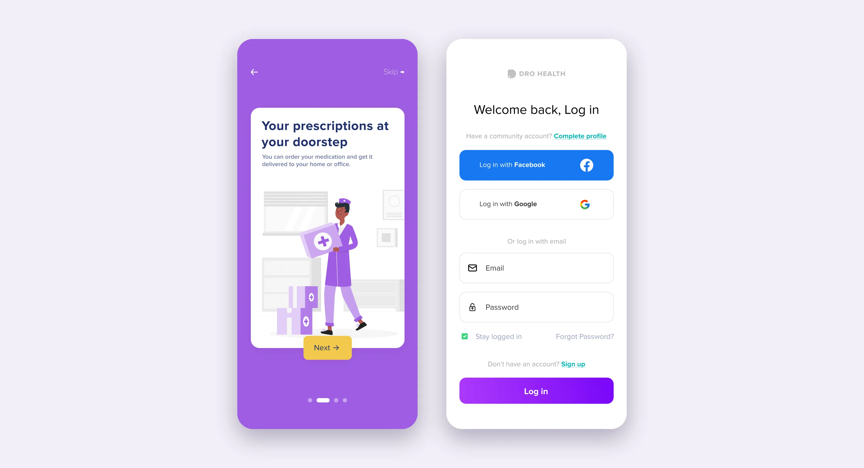
- Moved medical-detail collection from sign-up to the first booking, reducing sign-up drop-off by 18%.
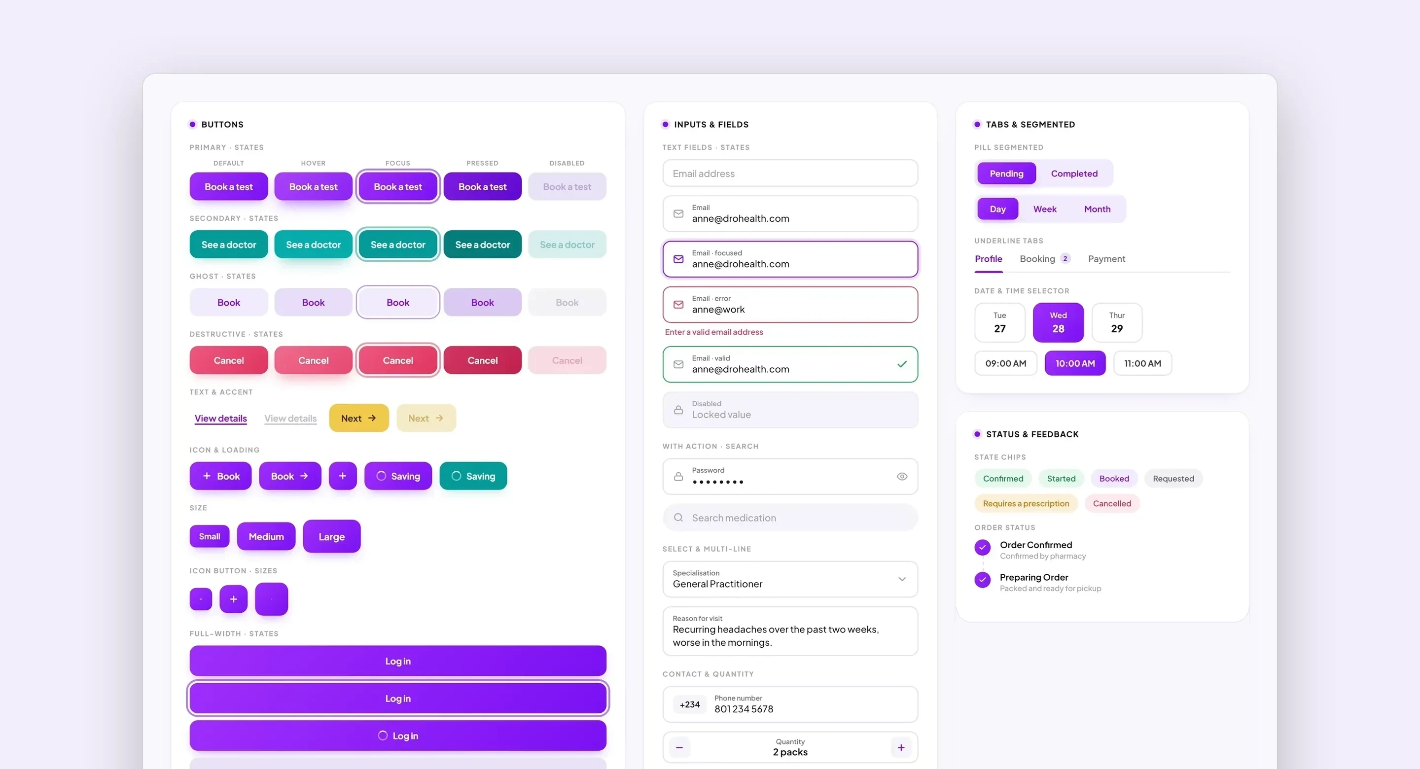
- Worked with two other designers on a shared component system across app and website; user satisfaction rose 45%.
Busha (busha.co), Product Designer
May 2019 – October 2019
- Redesigned the admin dashboard and multiple product pages for a new application on the exchange platform.
Transformify (transformify.org), UI/UX Designer
January 2018 – April 2019
- Partnered with product managers on research and user needs; translated requirements into user flows, wireframes and UI.
Independent, Contract Product Designer
January 2017 – Present
- Risevest (2025): redesigned onboarding, the dashboard and withdrawals for a dollar-investment app with 620K+ users; onboarding completion rose from 34% to 58%, and withdrawing went from 6 taps to 2.
- Lenox Park Solutions (2023): sole designer on an analytics platform for institutional investors with $4T+ in client assets; made side-by-side comparison the default view.
Mentoring
Mentored 30+ designers through portfolio reviews, mock interviews and career strategy. Trained 100+ students in workshops on problem framing and measuring impact.
Skills
Product & UX: Product strategy, end-to-end UX, user research (interviews, usability testing), information architecture, experience mapping
Design: Design systems, UI and visual design, interaction design, prototyping (Figma)
Collaboration: Cross-functional work with product, engineering and marketing; stakeholder alignment; design–engineering handoff; written, async communication
Languages
English