← all projects

Lenox Park

Sole product designer$4T+ client AUM2023–2024 · Fintech, DEI analytics

As the only designer, I redesigned an analytics platform institutional investors use to track diversity across their portfolios, for clients representing more than $4 trillion in assets. The brief was to turn dense data into decisions analysts could make under deadline.

Role
Sole product designer
Timeline
2023–2024
Team
Founder and 2 engineers
Scope
6 product areas and the marketing site
$4T+Combined client AUM
3,500+Registered users
3×Faster time to insight
↓60%Cross-referencing time
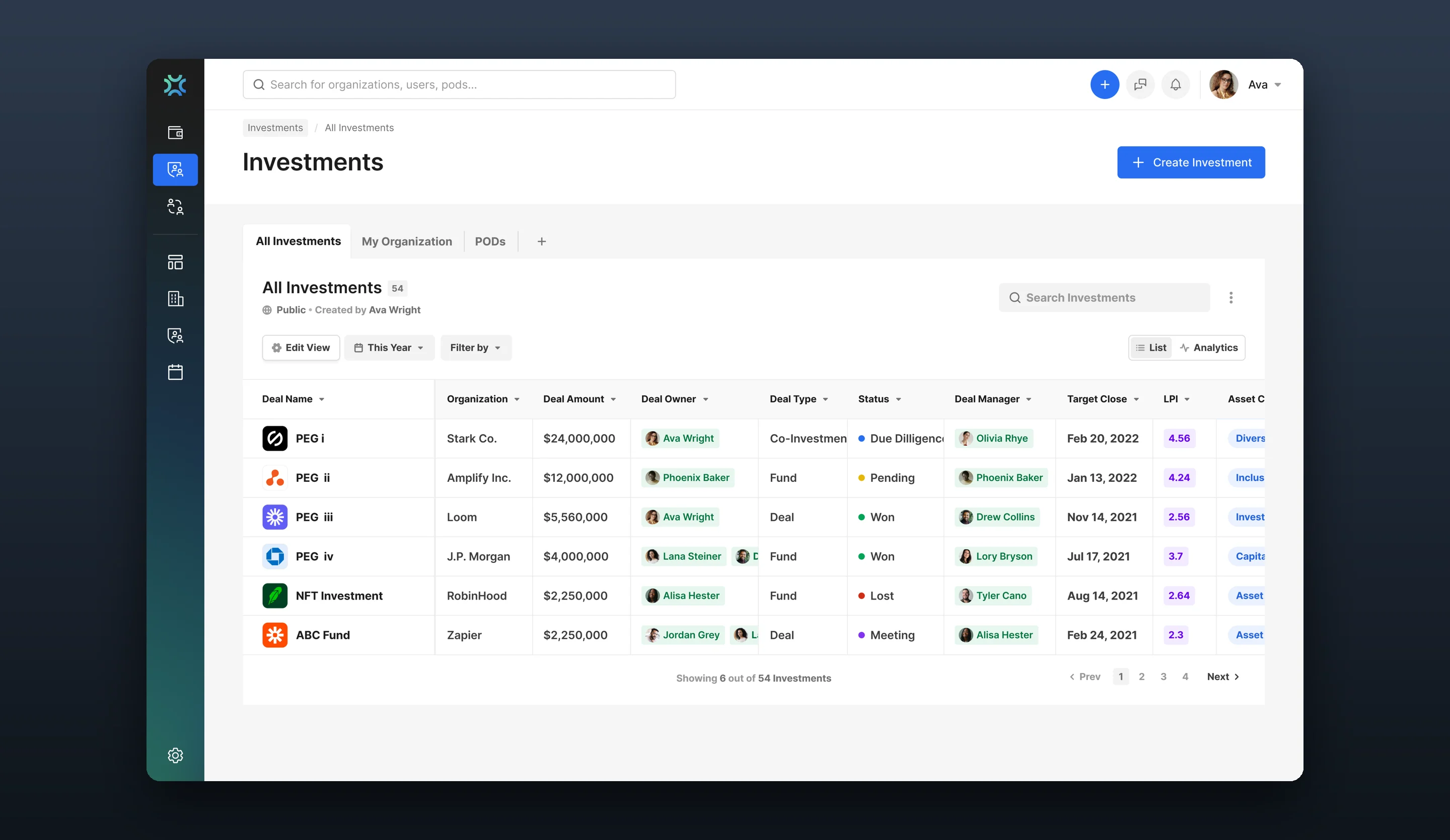
Lenox Park investments overview with diversity score trends and asset-class breakdown

Part one

The platform and my role

What the platform does, who relies on it, and everything I designed.

Overview

A Bloomberg terminal for diversity in finance

Lenox Park Solutions (RoundTables) helps pension funds, endowments and family offices track diversity across the managers and companies they invest in. Its clients represent more than $4 trillion in assets.

The users are investment analysts making compliance decisions on dense, multi-dimensional data. They’re experts, and the interface still overwhelmed them. As the only designer, working directly with the founder and two engineers, I had to learn institutional compliance fast enough to design for people who’d spent careers in it.

What I designed

The whole platform, end to end

Investment tracking, analytics, surveys, collaboration and the marketing site.

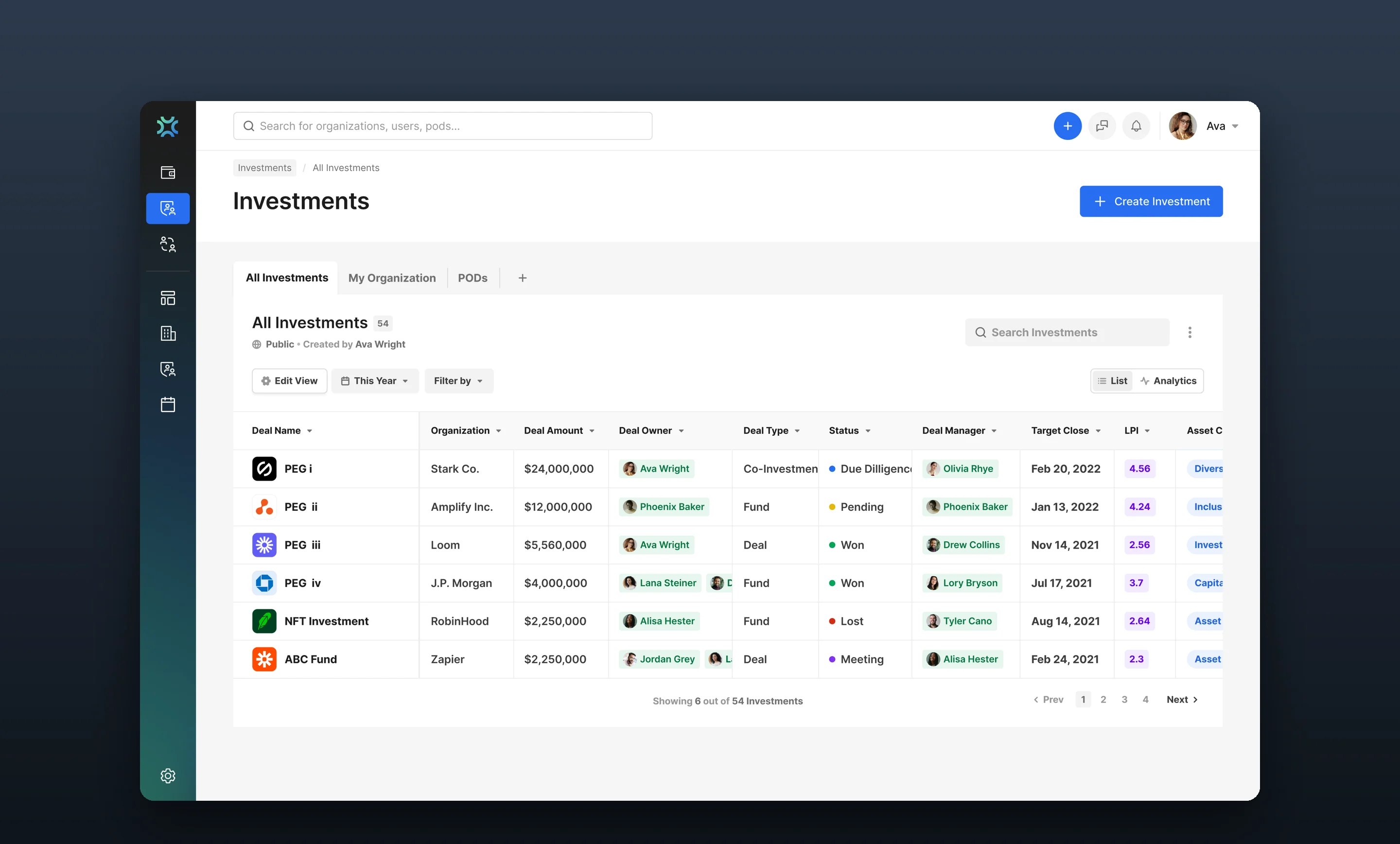
Investments overview screen
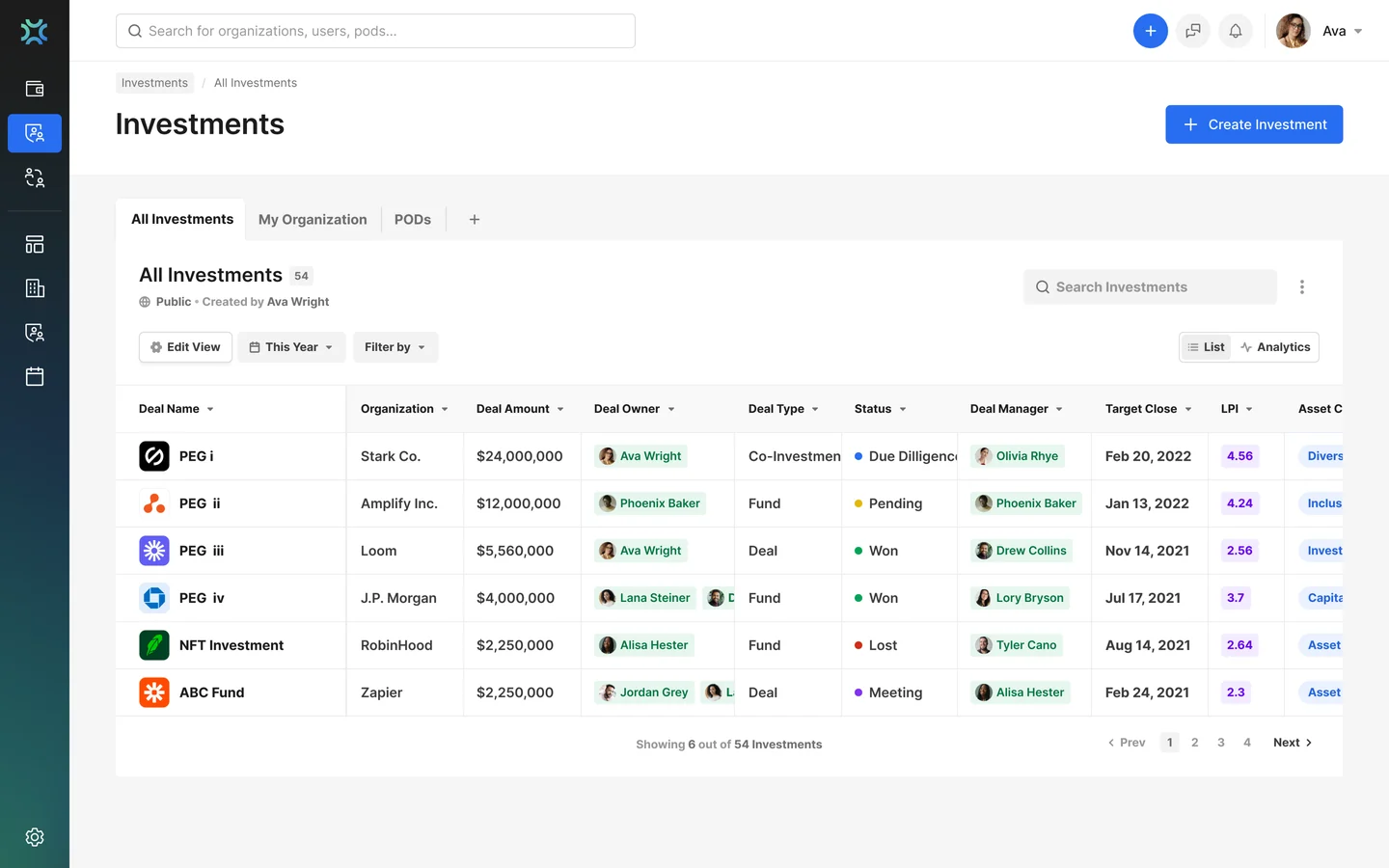
01Investments overview

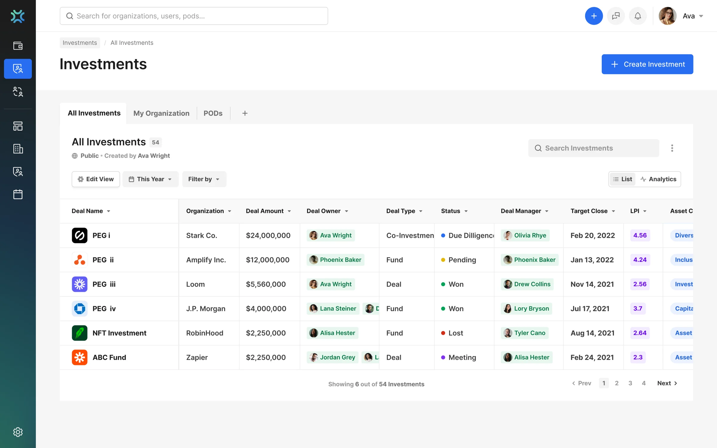
Status, score and role on every row, so analysts scan 50+ investments and spot what needs action.

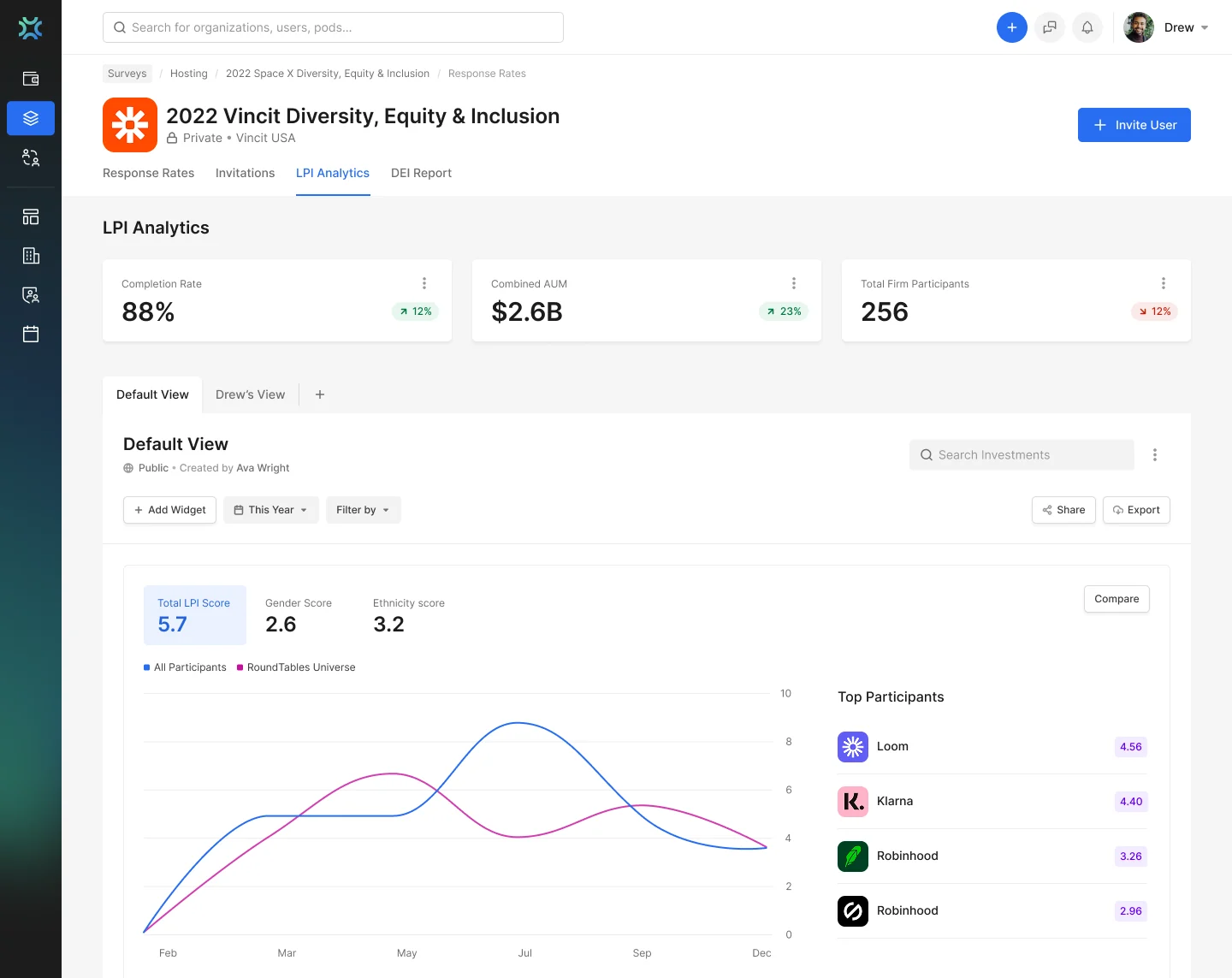
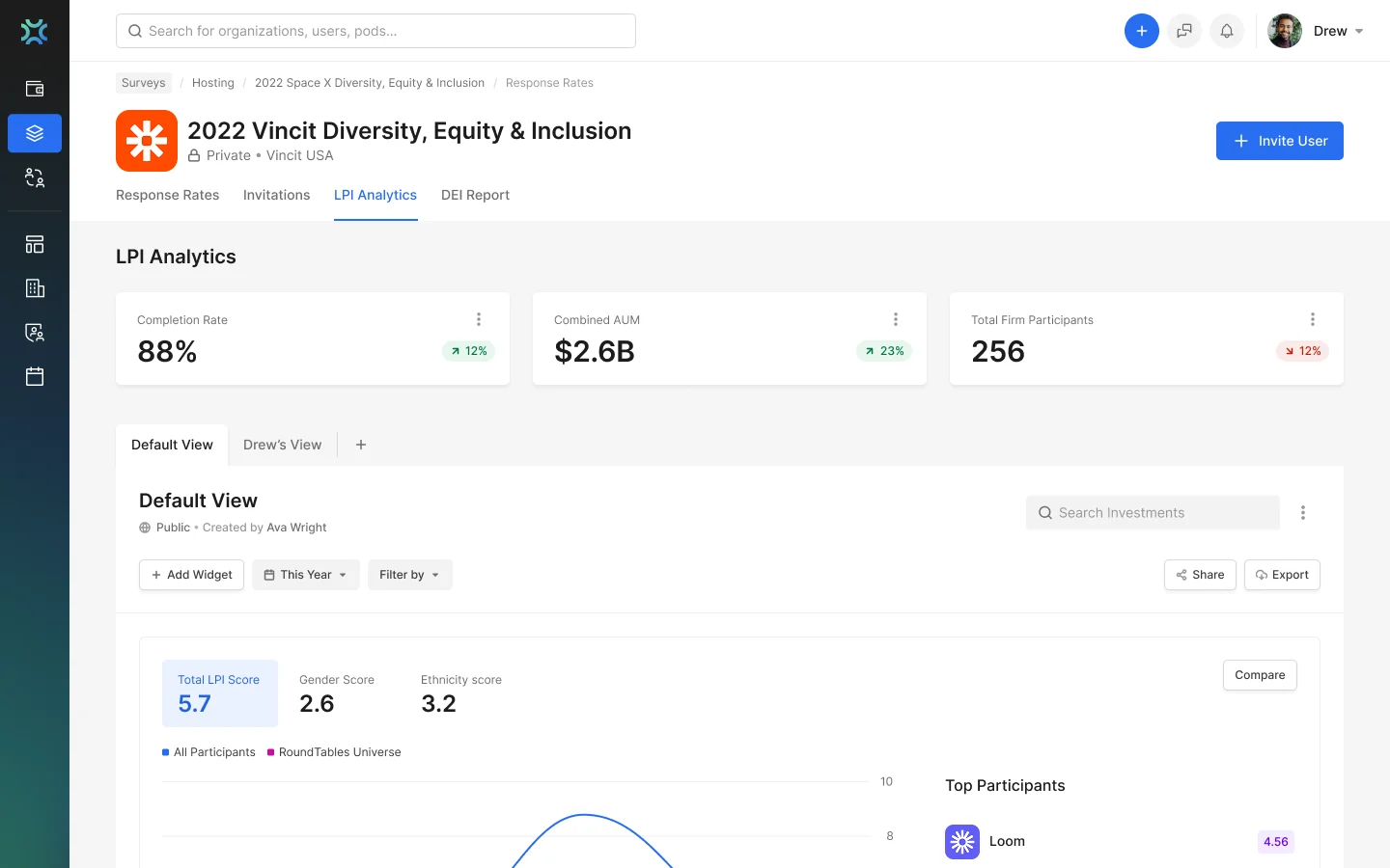
Analytics dashboard screen
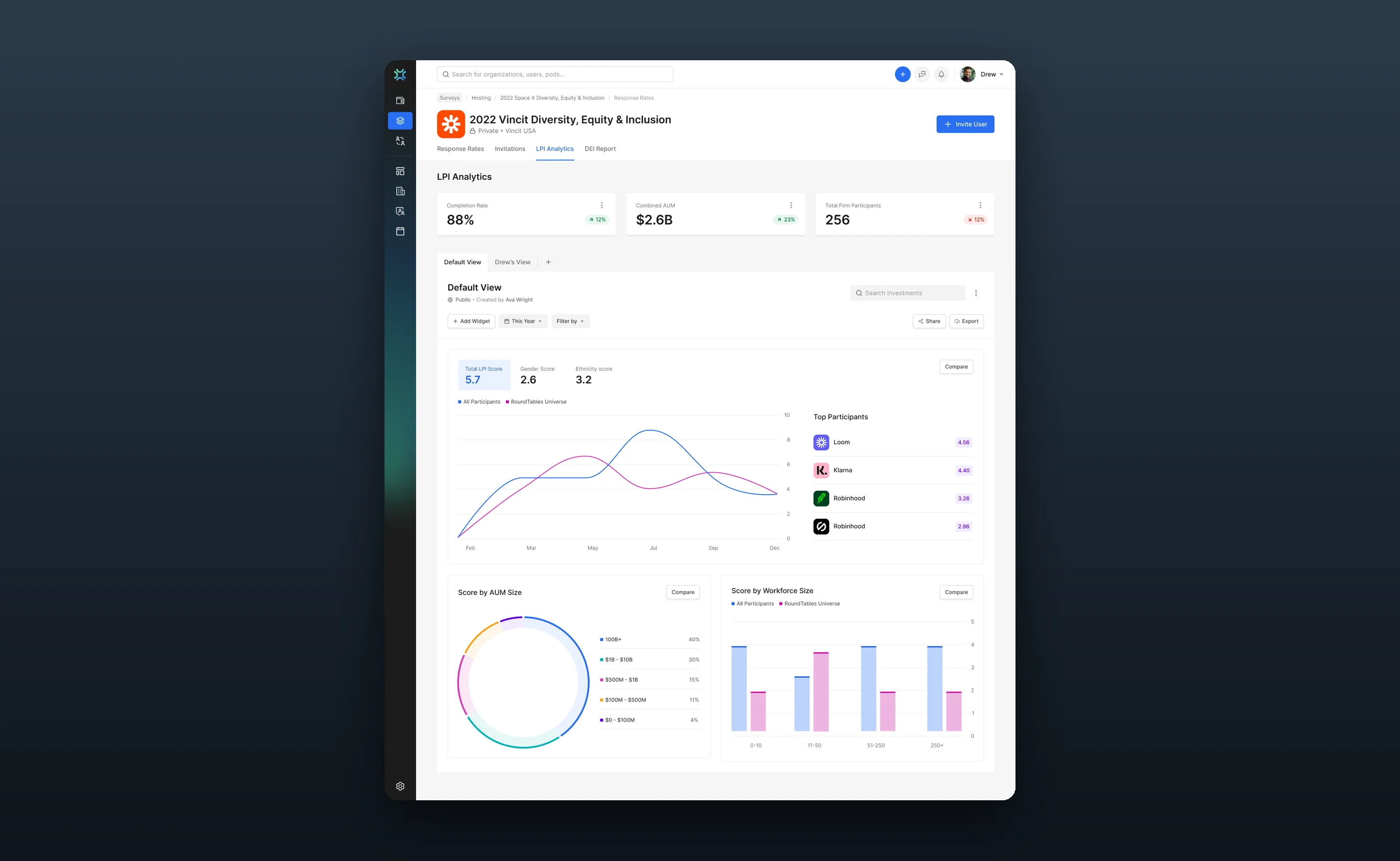
02Analytics dashboard

Scores, diversity trends and benchmarks by fund size and workforce. The screen analysts use daily.

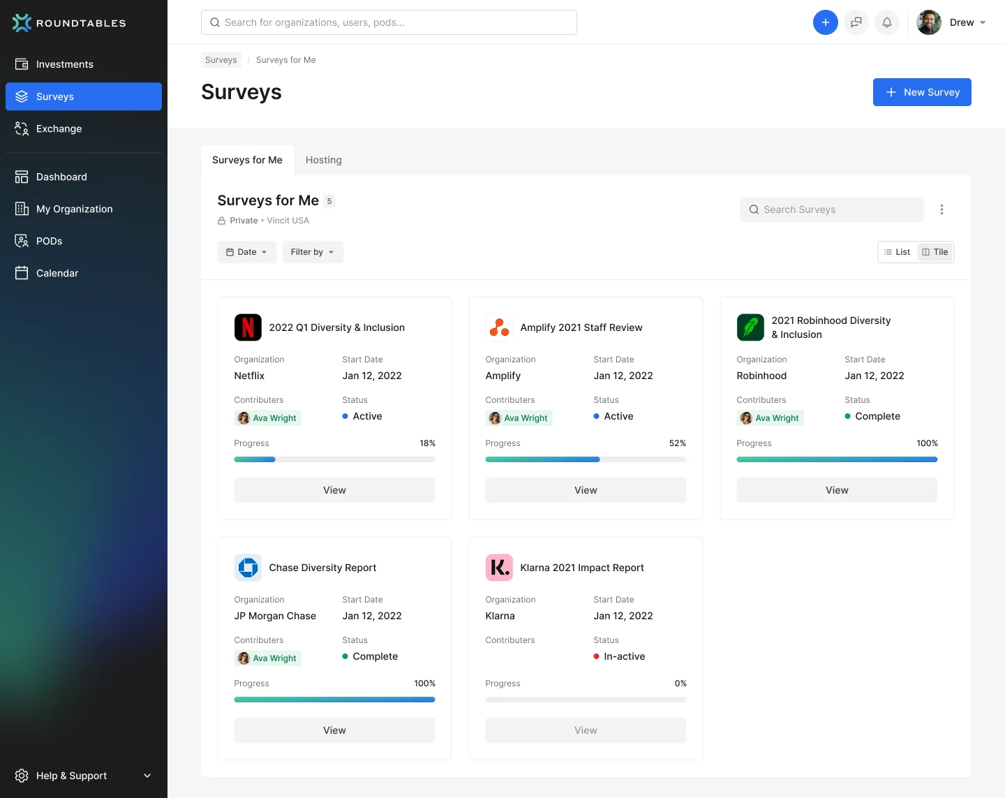
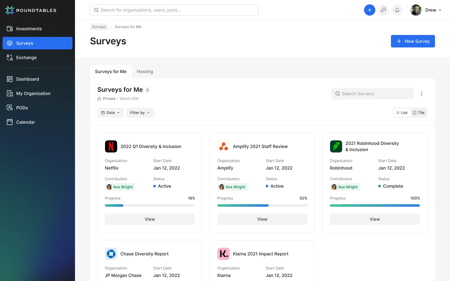
Diversity surveys screen
03Diversity surveys

Collection and progress across portfolio organisations, so nothing outstanding gets missed.

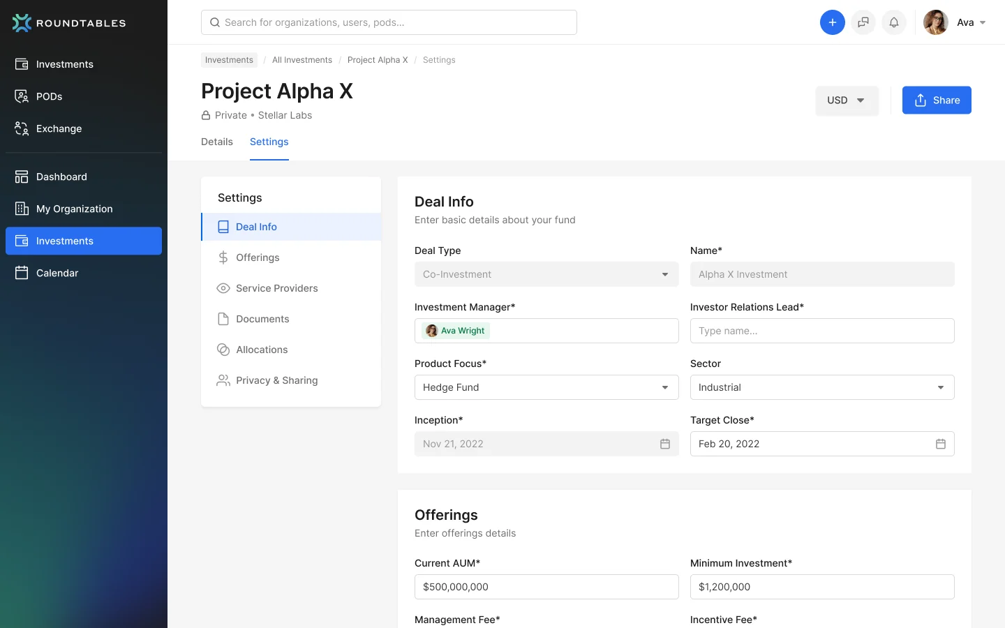
Deal detail and collaboration screen
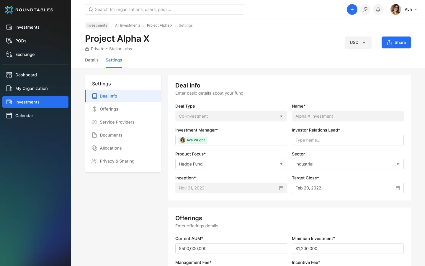
04Deal detail and collaboration

Investment data, managers and a team activity feed on one page.

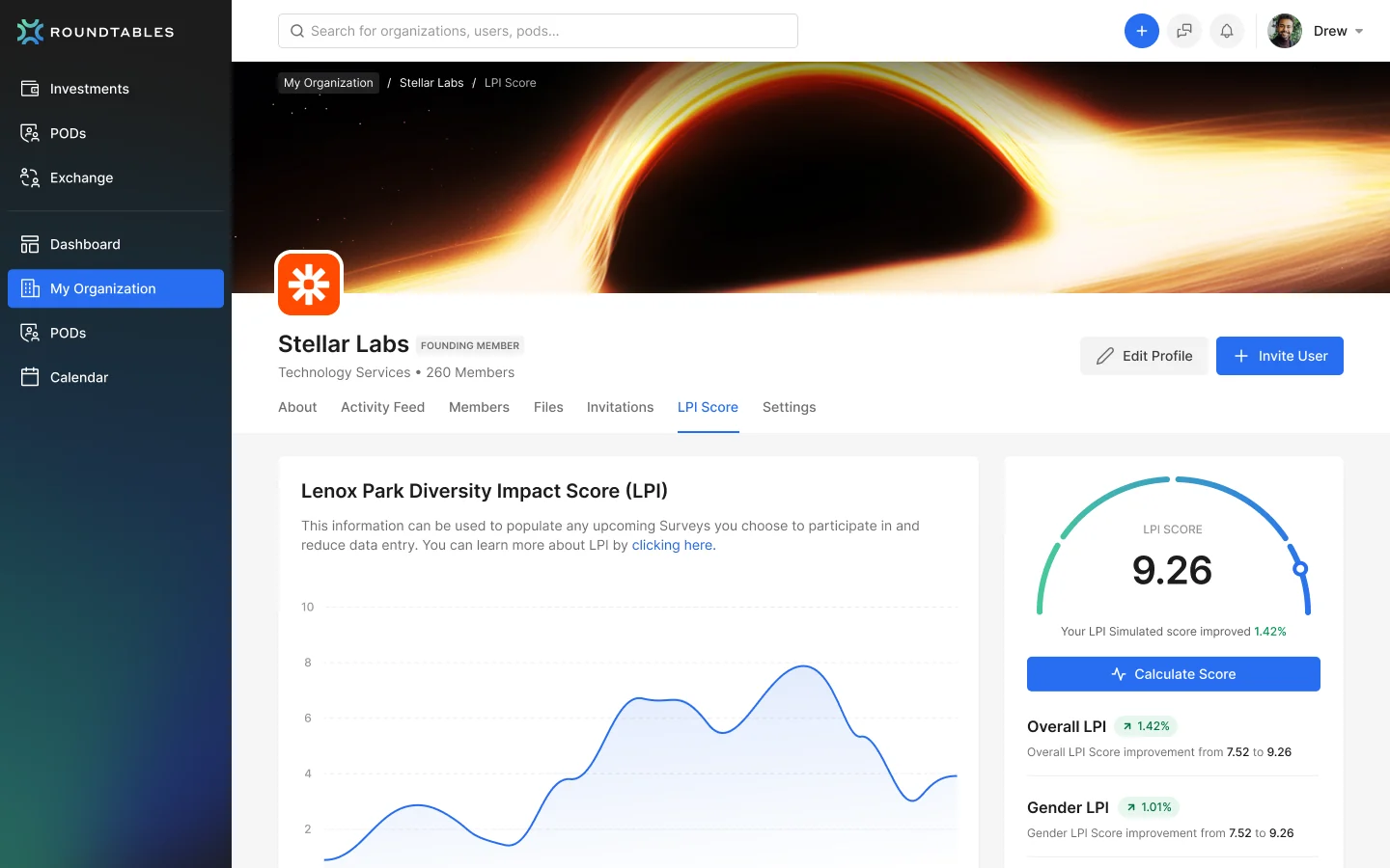
Organisation scoring screen
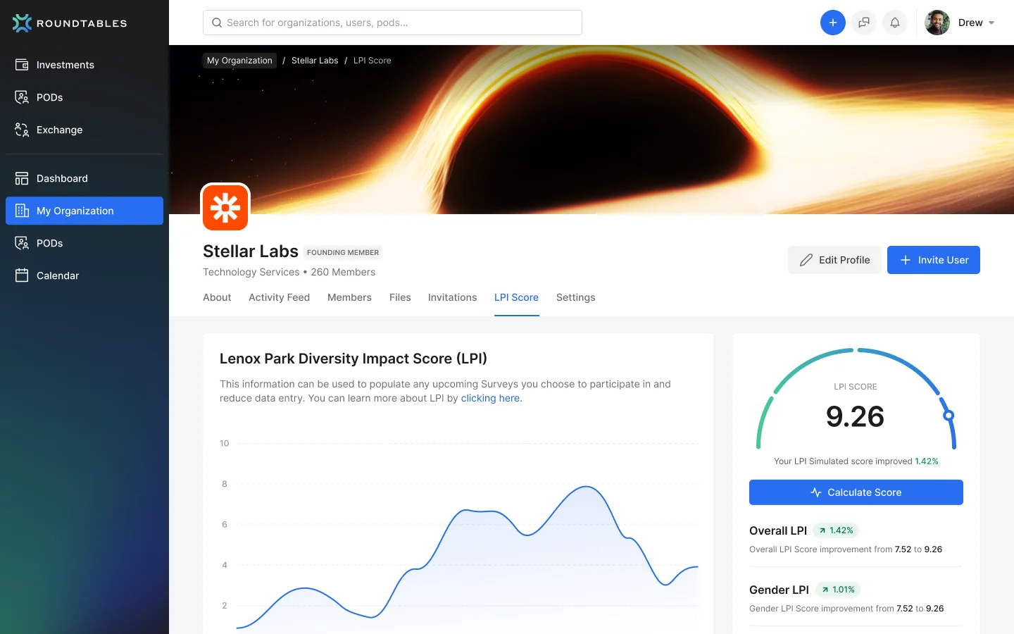
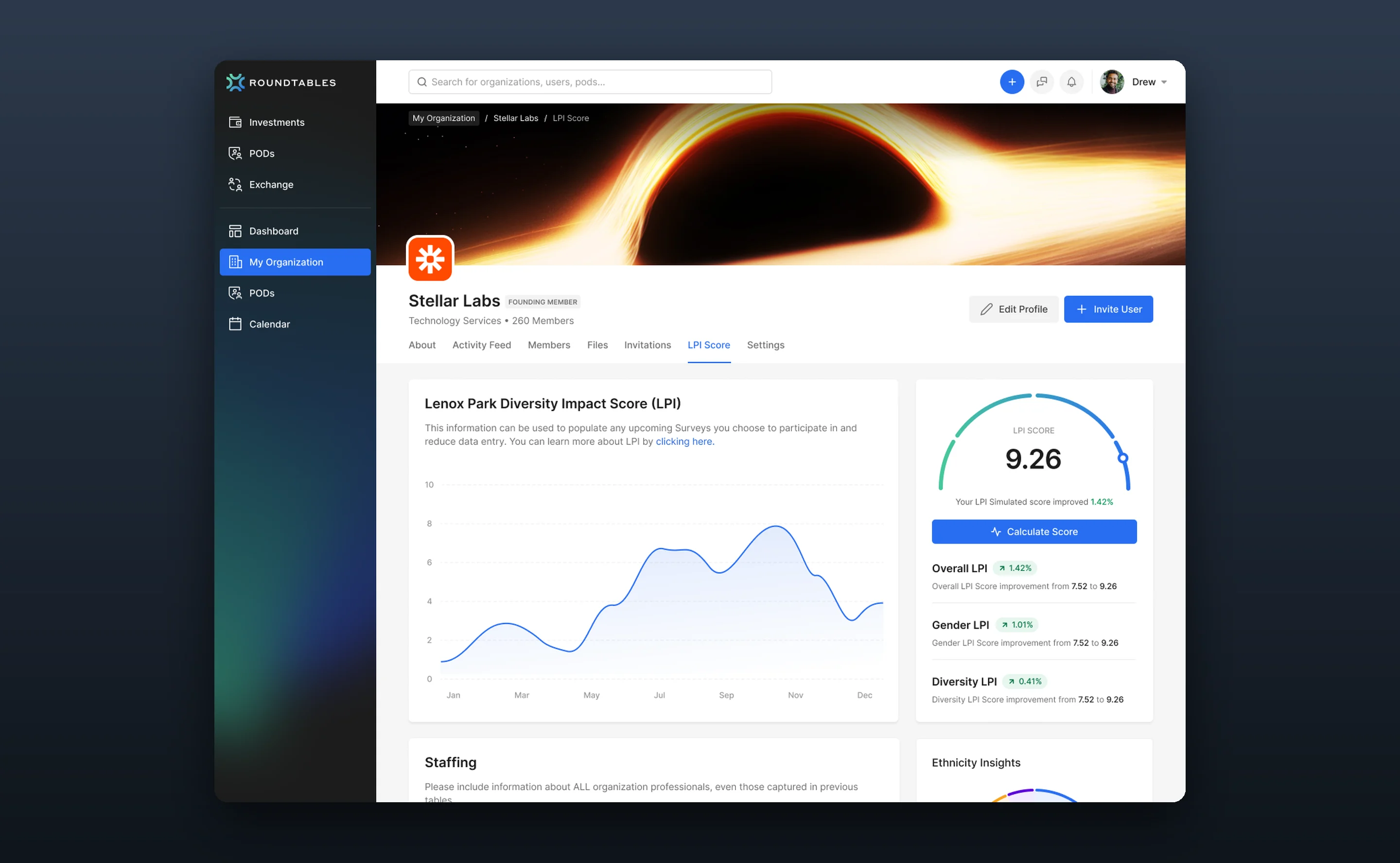
05Organisation scoring

Per-organisation scores with breakdowns, staffing inputs and simulated improvements.

Marketing site screen
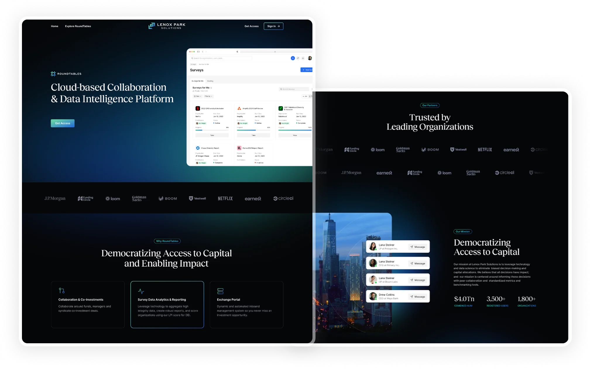
06Marketing site

The public story for a product sold to institutional buyers.

Part two

Deep dive: designing for comparison

Why expert users were still overwhelmed, and the three calls that made comparison the default.

The problem

Data everywhere, decisions nowhere

The platform had plenty of data. The problem was acting on it. Analysts couldn’t quickly see which investments needed attention, which organisations were improving, or where compliance gaps were.

Repeat for every company
01

Open the portfolio

Every metric at equal weight, row after row.

50+investments with no hierarchy
02

Move between views

One company at a time, held in memory.

60%of analyst time spent cross-referencing
03

Export to Excel

The only practical way to compare companies.

04

Compare by hand

Rebuilding a view the product should have provided.

05

Report

Quarterly reporting, under deadline.

Daysof preparation each quarter
50+investments with no hierarchy
60%of analyst time spent cross-referencing
Daysof preparation each quarter

What we learned

Analysts compare. They rarely inspect.

I interviewed analysts and watched how they prepared quarterly reports.

Interviews

Everything is relative

Nobody asked “how is Fund A doing?” They asked “how does Fund A compare to Fund B?”

Observation

Experts were overloaded too

These were people with decades of experience. If they struggled, the interface was wrong.

Context

Deadlines set the pace

Quarterly reporting meant answers in hours, not days. Every extra click cost real time.

The insight

The primary task was comparison. Every decision after this was about making comparison the default instead of an export.

User flow

Before · the quarterly review, as analysts described it

QuarterlyreviewOpena companyNote itsscoresMorecompanies?Paste intoa spreadsheetCompareand reportyes, open the next oneno

Interview guide

Interview guide · Portfolio analysts

01Context

  • Your fund, how many companies you track, who reads the report

02The quarterly review

  • Walk me through your last one
  • Where does the data end up?

03Comparison

  • Which companies do you line up, and on what?
  • How do you spot the outlier?

04Time

  • What takes longest, and why?
  • What would you need on screen to stop exporting?

Pain points

Comparing3

One company per pageCan’t benchmark vs the universeNumbers held in my head

Moving data3

Re-typing scores into ExcelBoard pack built by handCan’t share a view

Reading3

Charts in no particular orderHard to see what changedSurvey status is scattered

Rebuilt from my research notes: the quarterly review as analysts described it, the interview guide, and their pain points grouped by theme.

How analysts work

The task, before and after

I mapped what analysts actually did each quarter, step by step. The old product forced a sequence that fought how they think.

Before: one company at a time

  1. Open a company
  2. Note its scores
  3. Open the next one
  4. Note again
  5. Paste into a spreadsheet
  6. Compare there

Days of quarterly prep, numbers held in their heads

After: comparison by default

  1. Pick the companies
  2. Same metrics, side by side
  3. Spot the outlier

3× faster time to insight

Key decisions & trade-offs

Three calls that made the data usable

Decision 01

Design for comparison, not inspection

The call

Side-by-side scores, trends and benchmarks across companies, visible without scrolling.

The trade-off

Single-company pages are the obvious structure for a data product, and they forced analysts to hold one company in their head while opening another. A comparative default matched how they already reasoned.

Organisation diversity score with trend, breakdowns and staffing inputs

Decision 02

Let experts choose their depth

The call

Summary cards first (total investments, AUM, impact-adjusted AUM), with full detail one step down.

The trade-off

Hiding data would have looked simpler and failed these users, who need density. The answer was order, not reduction: summary first, detail on demand, the “scan, then dive” pattern I saw in every session.

Deal detail with investment info, allocation and manager details

Decision 03

Let peripheral vision do the filtering

The call

Status, score and role are encoded visually on every row, so the three deals that need attention stand out from fifty.

The trade-off

Text labels were accurate and meant reading every row. Visual encoding gives up a little explicitness and saves what analysts don’t have near quarter-end: time.

Investments table with status dots, score chips and role badges

The shipped product

The comparison workflow, end to end

Five screens from the shipped product, in the order an analyst moves through a quarterly review: portfolio, market view, organisation, surveys, deals.

Plays automatically · click any step to jump to it

Start from the portfolioRead the portfolio against the marketGo one level deeperTrack the inputsSet up a deal

Before vs. after

What changed for analysts

Before

After

Every metric at the same weight→A clear hierarchy, summary first
One company at a time→Side-by-side comparison by default
Reading every row for status→Status visible at a glance
Exporting to compare→Comparison inside the product
Days of quarterly prep→Hours of quarterly prep

Outcome

Analysts stopped exporting to compare

3×

Faster time to insight

With comparison as the default view.

Before
After
↓60%

Cross-referencing time

Less switching between views.

Hours

Quarterly reporting prep

Down from days.

The comparative layout became the default view. Cross-company analysis moved out of spreadsheets and back into the product.

Reflection

For experts, “simple” means well-structured, not less information.

The instinct is to hide data to reduce complexity, but analysts need density. They just need it organised. Summary-first with smart defaults gave them the depth they needed without the chaos they had.