all projects

Product Designer · 2019–2021 · Health Tech, Telehealth

DRO Health

Redesigned the telehealth experience for 50,000+ users, reducing sign-up drop-off by 18% and increasing satisfaction by 45%.

50K+
Users
100K+
Consultations
↓18%
Drop-off rate
+45%
Satisfaction
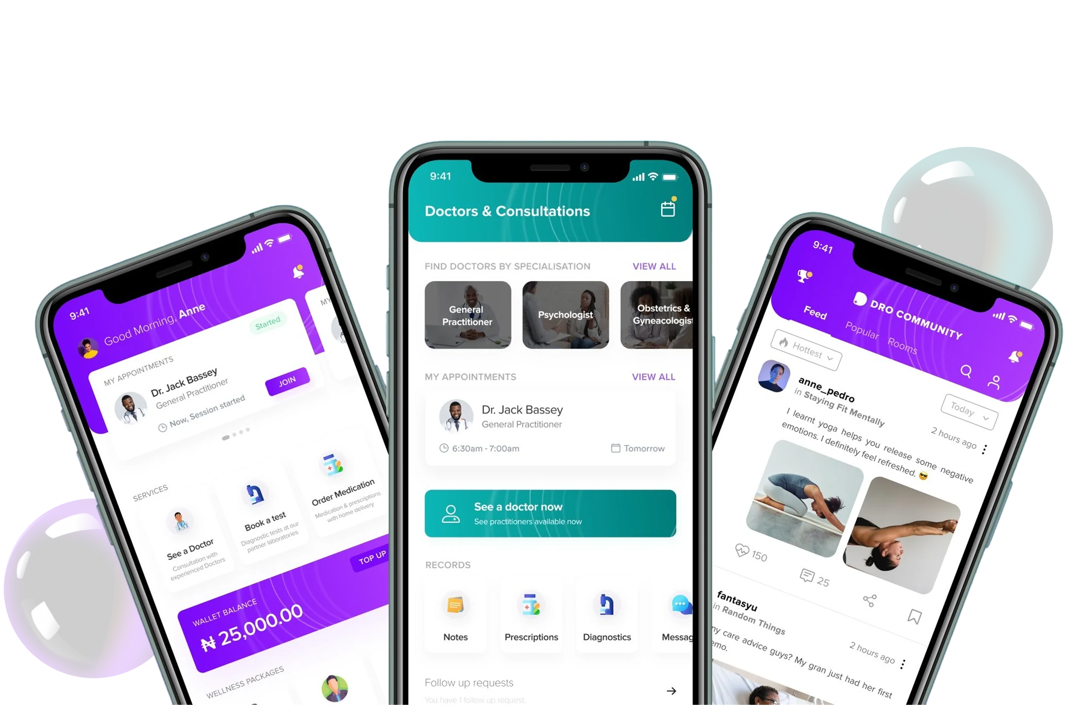
DRO Health — home dashboard, doctors and consultations, and community feed across three app screens

Part 1

about dro health

DRO Health is a digital healthcare platform making medical care accessible via smartphones across Nigeria: consultations with licensed doctors, medication ordering with home delivery, diagnostic lab tests, wellness programs, and health-records management, all in one app.

In a market where seeing a doctor often means a full day lost to travel and waiting, DRO Health lets users get care in minutes. The stakes are personal, users are managing real health concerns, not browsing. Every friction point has a direct cost to someone’s wellbeing.

Context & team

My role
Product Designer, end-to-end redesign
Team
Co-Founder, 2 designers, engineering team
Scope
Mobile app, website, design system

What I designed

Every major flow in the healthcare experience

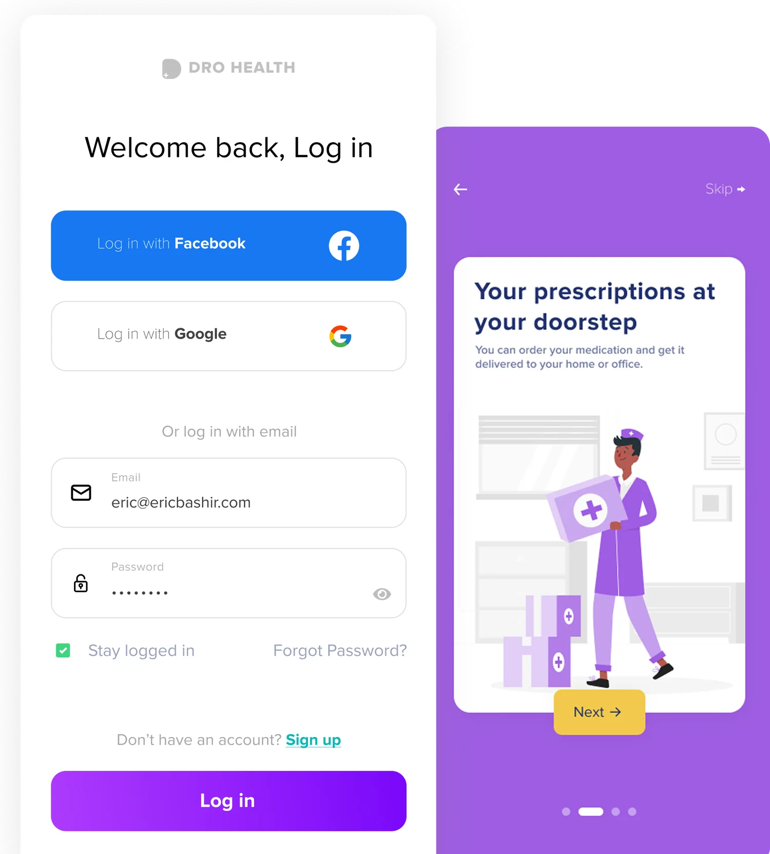
DRO Health login screen with social sign-in and prescription-delivery onboarding

Onboarding & Sign-up

Redesigned the signup flow with social login and step-by-step onboarding, reduced drop-off by 18% by removing unnecessary fields and adding progress indication.

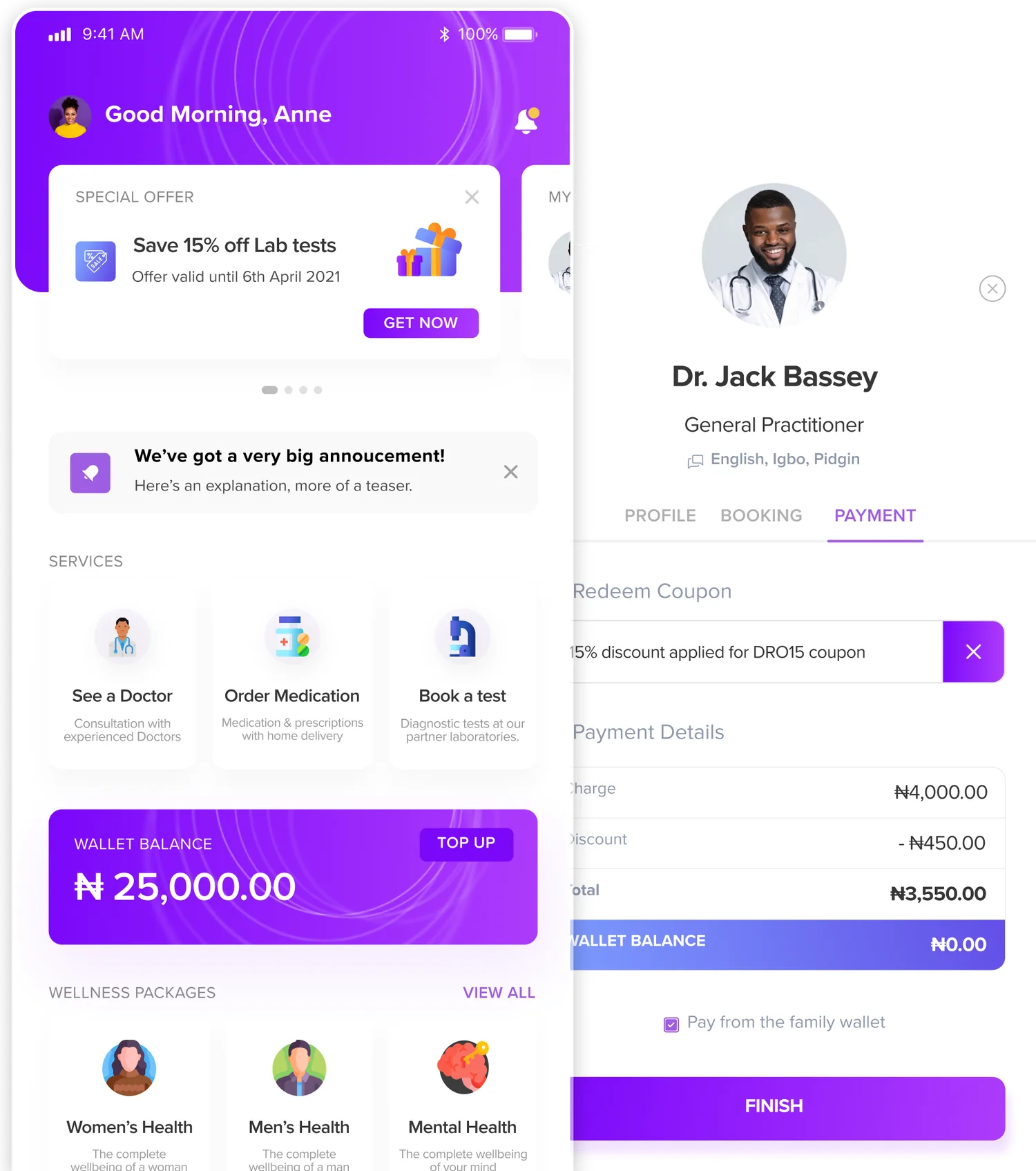
DRO Health home dashboard and doctor payment screen with coupon redemption

Consultations & Booking

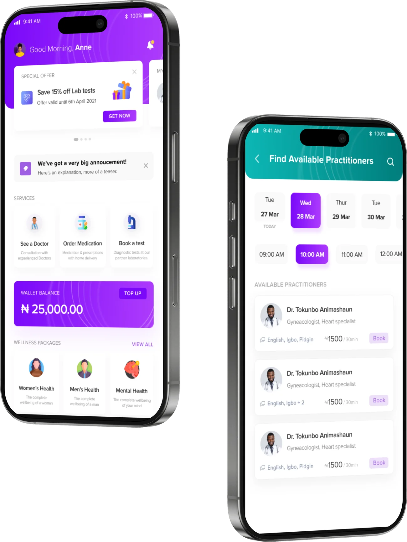
Redesigned doctor discovery, appointment booking, and consultation flows. Users find a doctor by specialization, date, and time, and book in under 60 seconds.

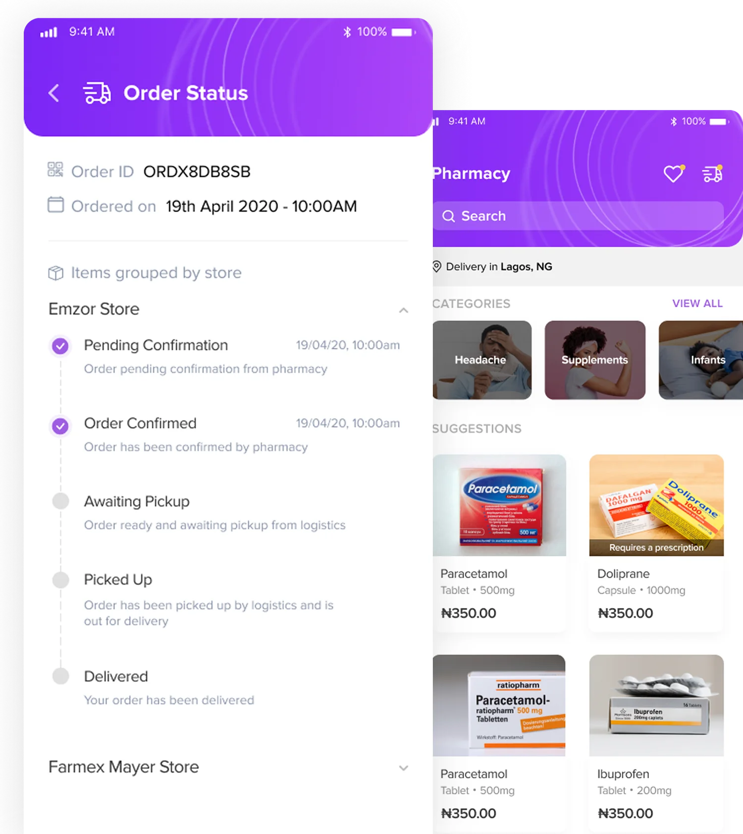
DRO Health order-status tracking timeline and pharmacy catalogue

Pharmacy & Medication

Designed the medication-ordering flow with pharmacy search, delivery tracking, and order status, home delivery with real-time updates from confirmation to doorstep.

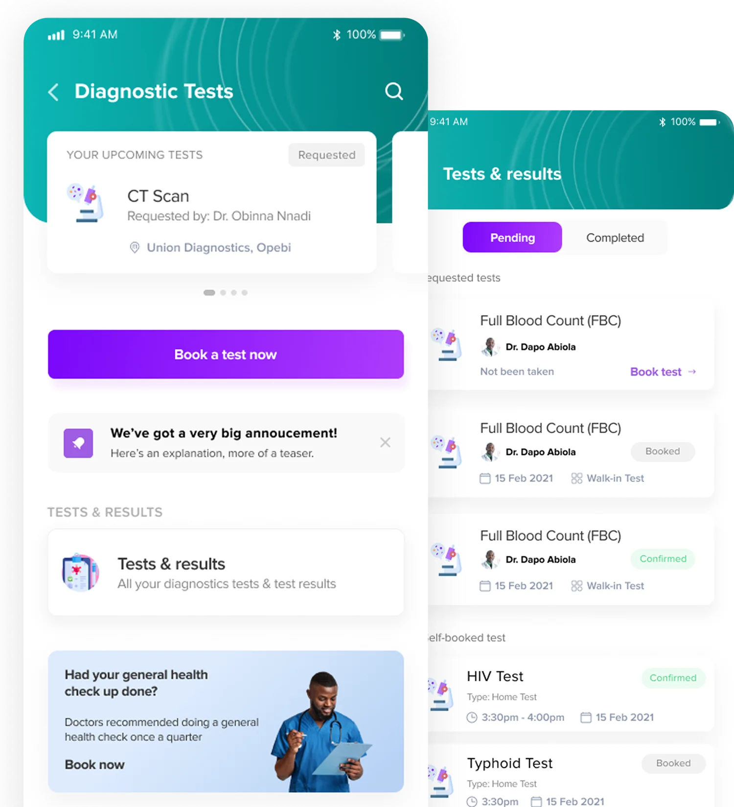
DRO Health diagnostic-test booking and tests-and-results list

Diagnostic Tests & Results

Designed lab-test booking and results tracking, upcoming tests, pending results, and completed reports in one view with clear status indicators.

Part 2, Deep Dive

making healthcare access effortless

The platform had all the right services but made them hard to reach. Users wanted to see a doctor, order medication, or book a test, three simple goals buried under cluttered navigation and confusing flows.

The problem

Losing users at the moments that mattered most

  • Sign-up asked for too much information upfront, 18% of users abandoned before completing registration.
  • The homepage showed everything at once, consultations, pharmacy, lab tests, wallet, and wellness all competing with no clear hierarchy.
  • Key actions (“See a Doctor,” “Order Medication”) were buried below the fold, users couldn’t find what they came for.
  • No visual trust signals, in healthcare, an inconsistent interface signals unreliable care.
DRO Health home dashboard and find-available-practitioners date and time scheduling screens

Key decisions & trade-offs

Decision 1

Reorganized IA around user intent

Restructured the homepage into three clear action zones, “See a Doctor,” “Order Medication,” “Book a Test.” Everything else is secondary.

Why this, not the alternativesThe old IA showed all features equally. User data showed 80% of sessions started with one of three goals. Prioritizing those three cut homepage decisions from 8+ to 3.

Decision 2

Progressive sign-up

Reduced initial signup to email + password only. Medical details are collected gradually during the first consultation booking, when context makes them feel necessary rather than intrusive.

Why this, not the alternativesFull-profile signup felt invasive for a healthcare app, users questioned why an app needed their address before they knew if the service was good. Defer details to moments of trust.

Decision 3

Unified visual system for trust

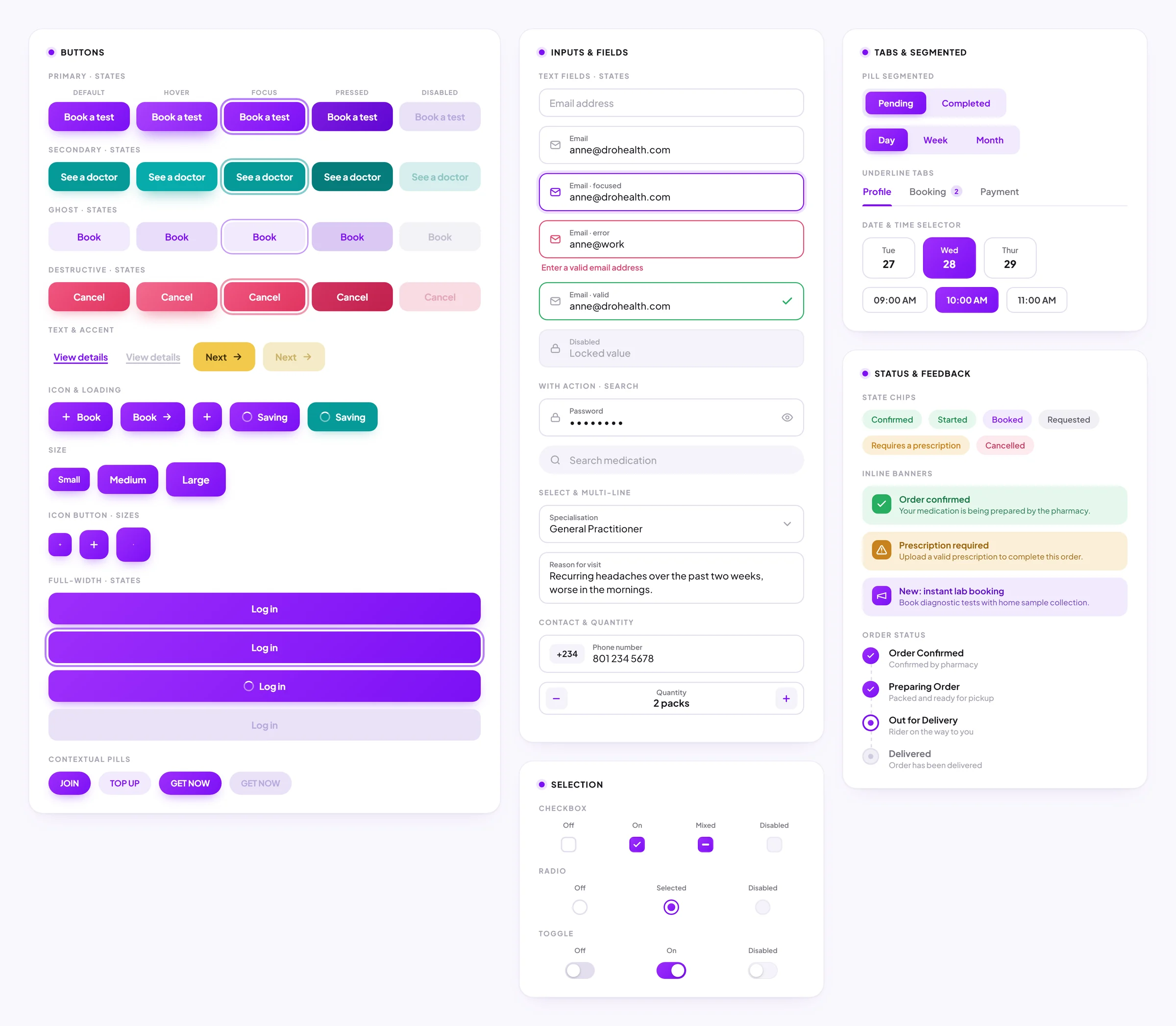
Built a cohesive component system with consistent spacing, typography, and interaction patterns. Primary actions in brand purple, secondary in outline.

Why this, not the alternativesIn healthcare, visual quality signals care quality. An inconsistent interface makes users wonder: “If they can’t get the app right, can they get my diagnosis right?”

DRO Health design system — buttons, inputs, selection controls, tabs and segmented controls, status chips and the order-status timeline, with full states and variants
DRO Health design system, the core component library, reconstructed

Before vs. after

Before
After
Navigation was stressful and unintuitive
Clear navigation and reorganized homepage for easy discovery
High drop-off during account creation and appointment booking
Streamlined signup and booking flows with fewer steps
Key services were hard to discover
Modern, accessible UI increased user satisfaction and trust

Impact & results

↓18%
Sign-up drop-off
+45%
User satisfaction
100K+
Consultations completed
80+
Licensed practitioners

The redesigned flows removed friction from the most critical moments. Users could go from opening the app to booking a doctor in under 60 seconds. The design system enabled faster feature iteration for the engineering team.

Reflection

Healthcare UX confirmed that trust signals matter more than efficiency alone. You can make a flow fast, but if users don’t feel safe, they won’t complete it. Visual quality in healthcare isn’t superficial, it’s whether users feel confident enough to share their symptoms with a stranger through a screen.

If I did this again, I’d advocate harder for post-consultation follow-up flows. We optimized getting users to a doctor but didn’t invest enough in what happens after, prescription tracking, follow-up reminders, health progress. That’s where long-term retention lives.

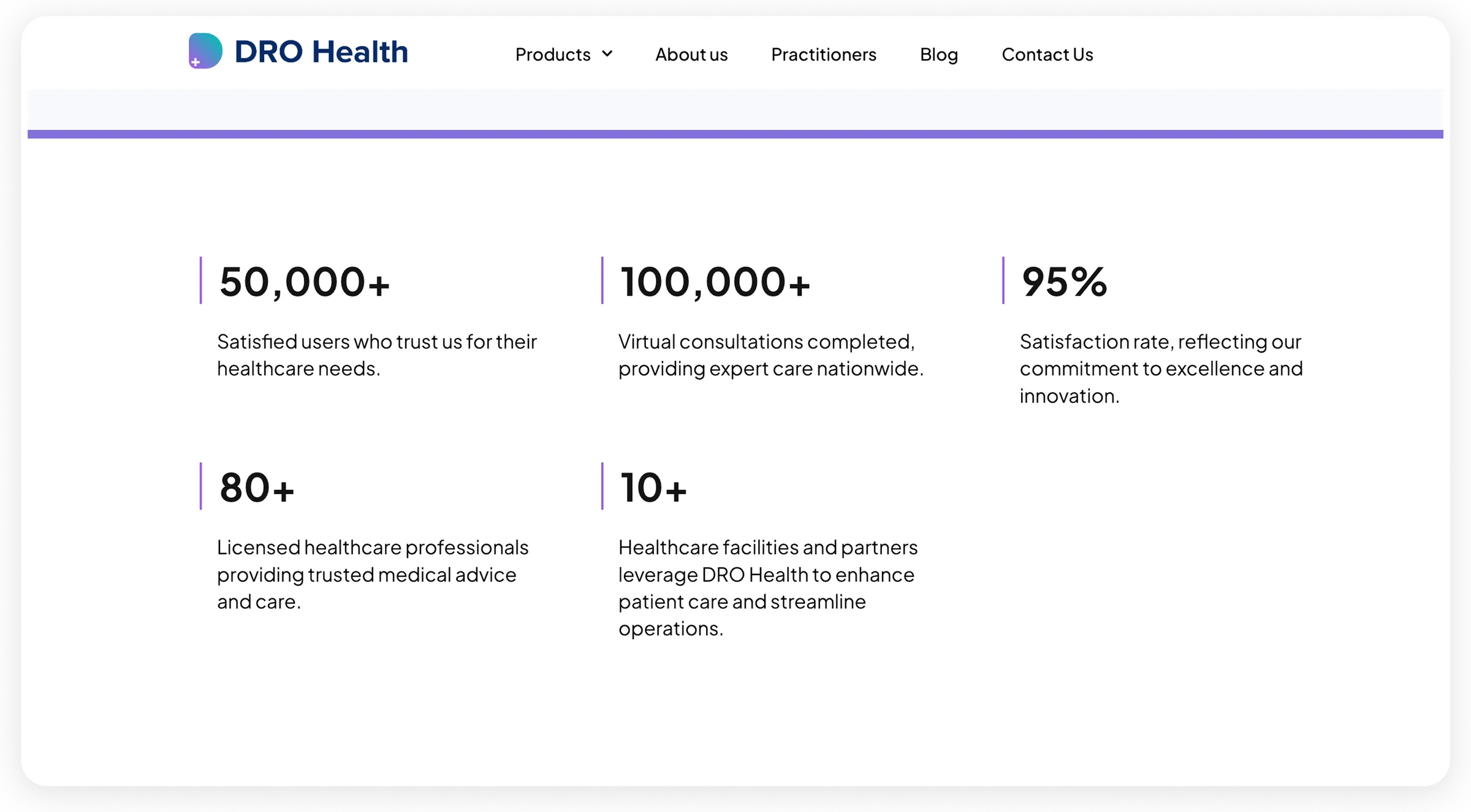
DRO Health website — 50,000+ users, 100,000+ consultations, 95% satisfaction, 80+ practitioners, 10+ partners

Credits

Chinonso Ohambele

Product Designer

Karen Cummings

Product Designer

Emeka Brian Iwuchukwu

Co-Founder