all projects

Senior Product Designer · 2025 · Fintech

Risevest

Redesigned the investment experience for 620,000+ users across emerging markets, turning confusion into confidence at every touchpoint.

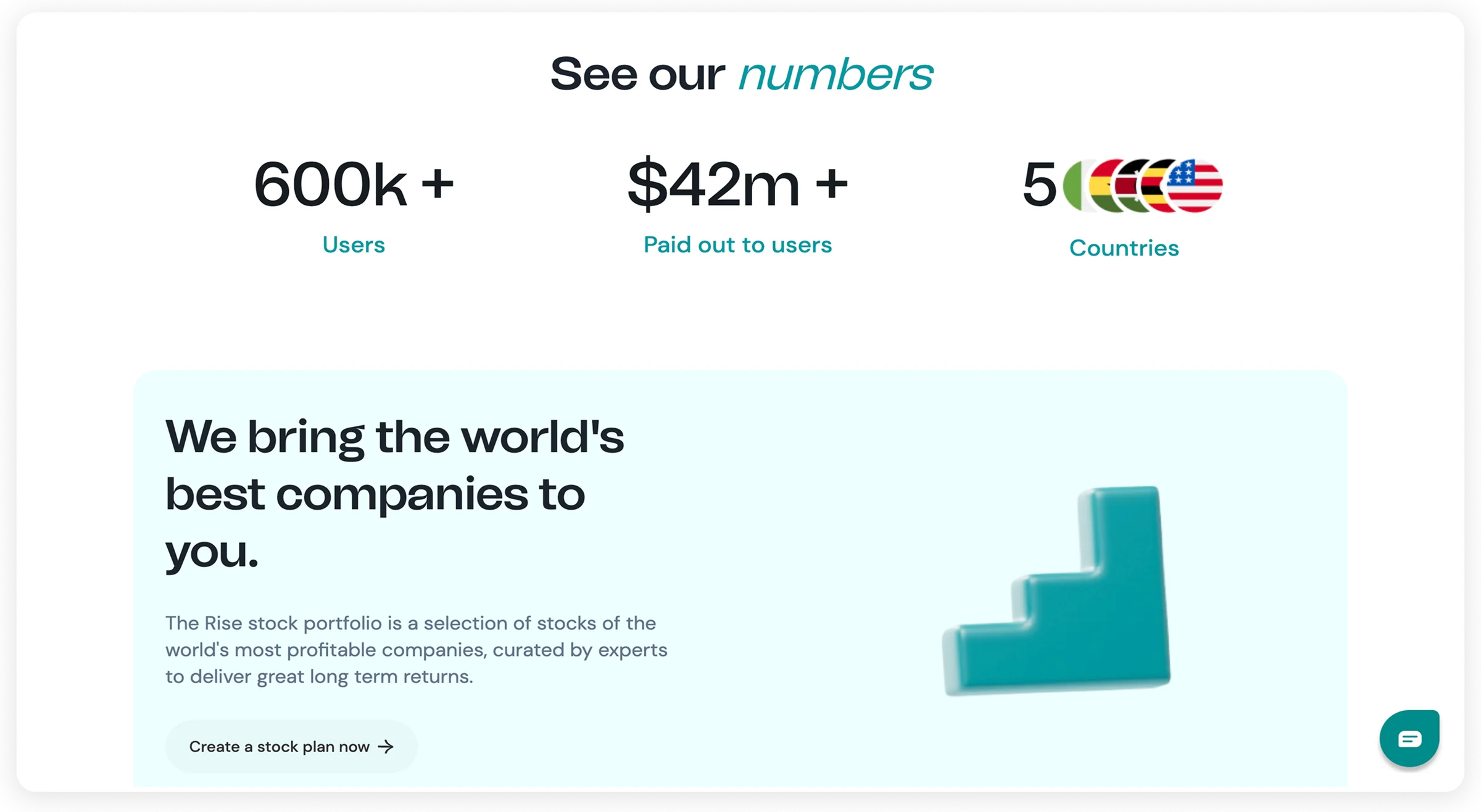
620K+
Active users
$42M+
Paid to investors
94%
Customer satisfaction
5
Countries served
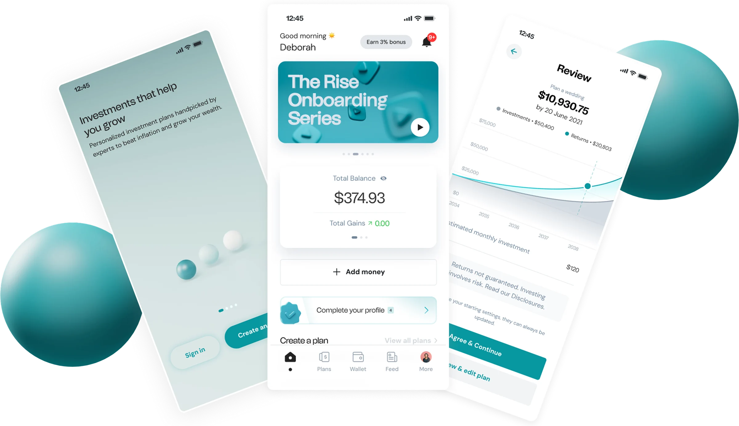
Rise mobile app — onboarding, home dashboard and plan review screens

Part 1

about risevest

Risevest is a digital investment platform that lets users in emerging markets, primarily Nigeria, Ghana, and Kenya, invest in dollar-denominated global assets: stocks, real estate, and fixed income, all from a mobile app. Over 620,000 users trust the platform with their money, and Risevest has paid out more than $42 million to investors.

In a market where inflation regularly erodes local-currency value, Risevest offers a way for everyday people to protect and grow wealth in dollars. The stakes are real, users trust this app with their savings, their wedding funds, their children’s education.

Context & team

My role
Senior Product Designer, mobile app redesign
Team
3 designers, 6 developers, 2 PMs
Constraint
Full feature parity while overhauling the visual layer

What I worked on

End-to-end mobile app redesign

I led the redesign of the whole Risevest mobile experience, from onboarding to portfolio management to withdrawals. Every screen, every flow, every interaction was rethought.

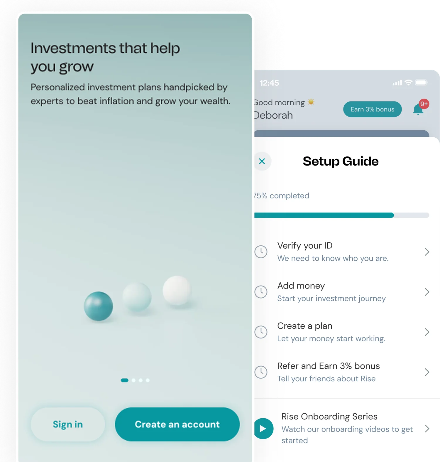
Rise onboarding intro screen and setup-guide checklist with progress

Onboarding & Setup Guide

Redesigned the first-time experience with a progressive setup guide, verify ID, add money, create a plan. Completion rose from 34% to 58%.

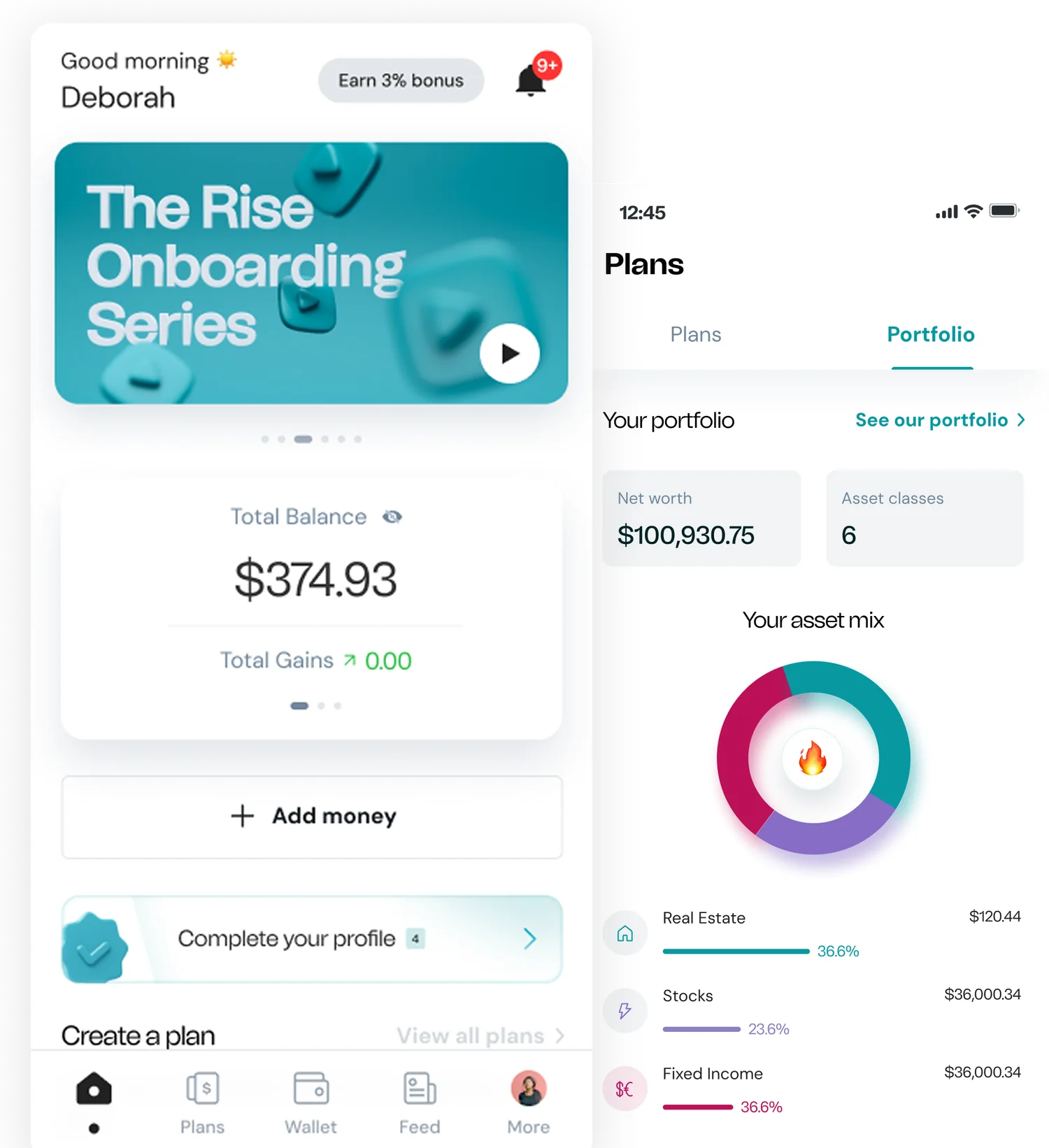
Rise home dashboard with total balance and portfolio asset-mix breakdown

Dashboard & Portfolio View

Redesigned the home screen to show total balance, portfolio breakdown, and quick actions at a glance, replacing a fragmented view that hid key information behind taps.

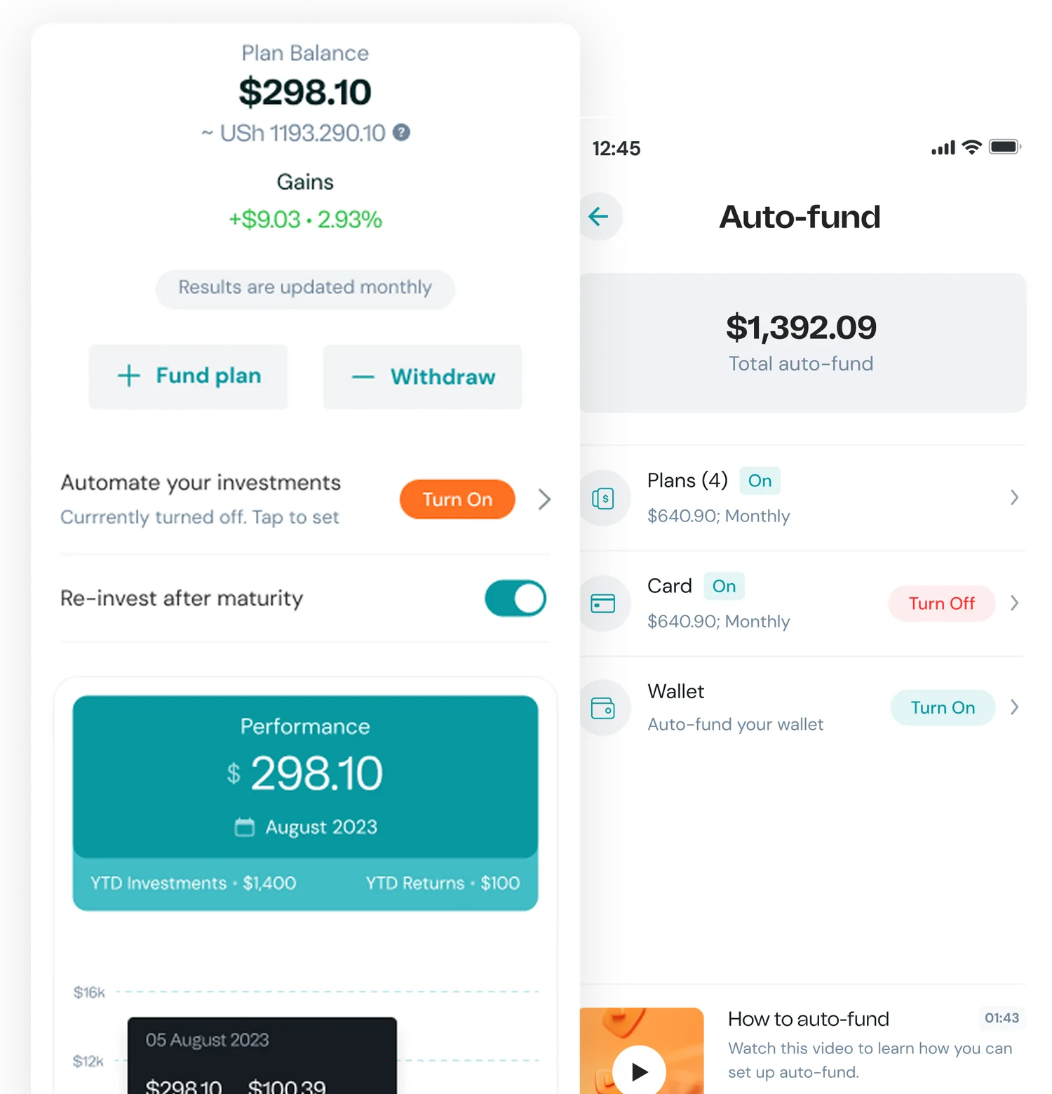
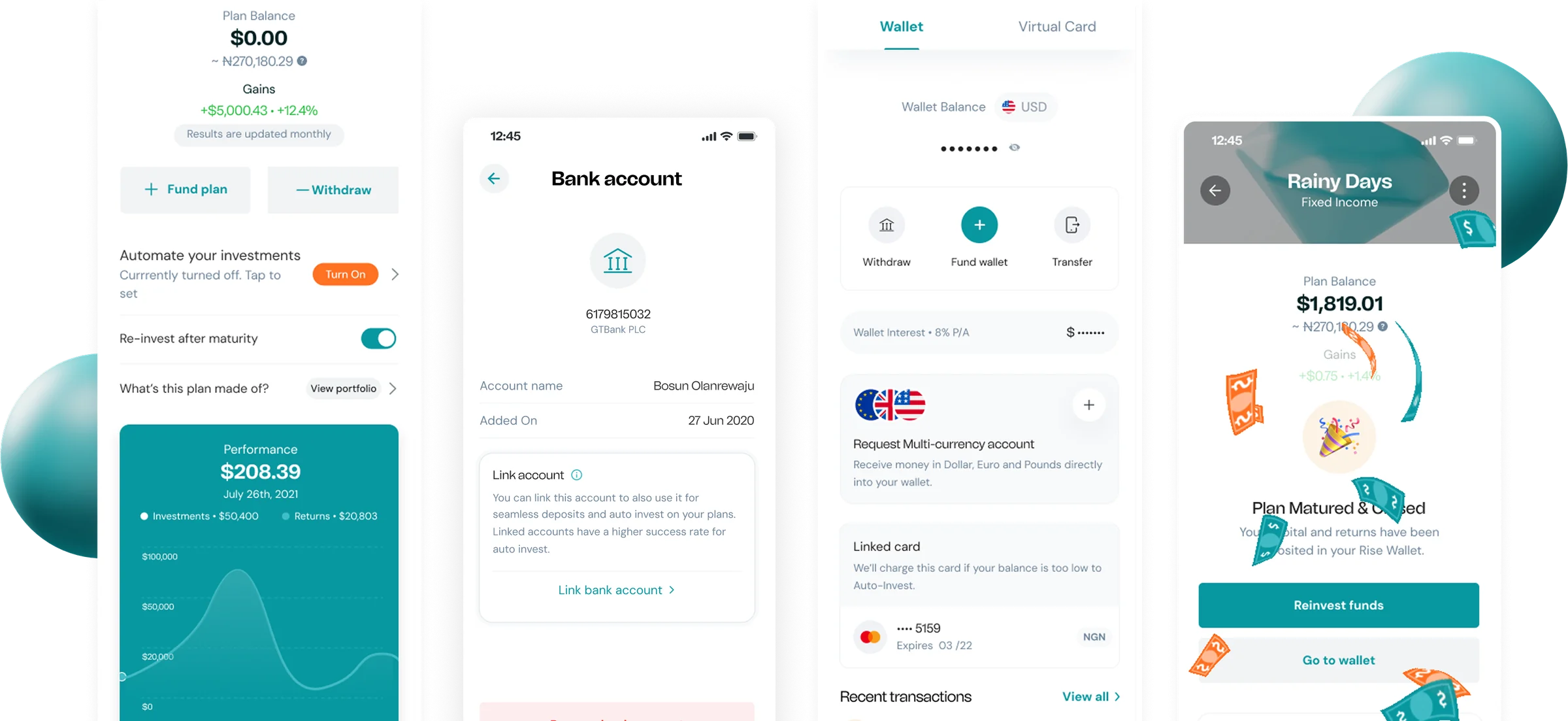
Rise plan detail with performance chart and auto-fund automation settings

Investment Plans & Auto-Fund

Redesigned plan management with clear performance charts, auto-invest toggles, and reinvestment options, making investing feel active, not passive.

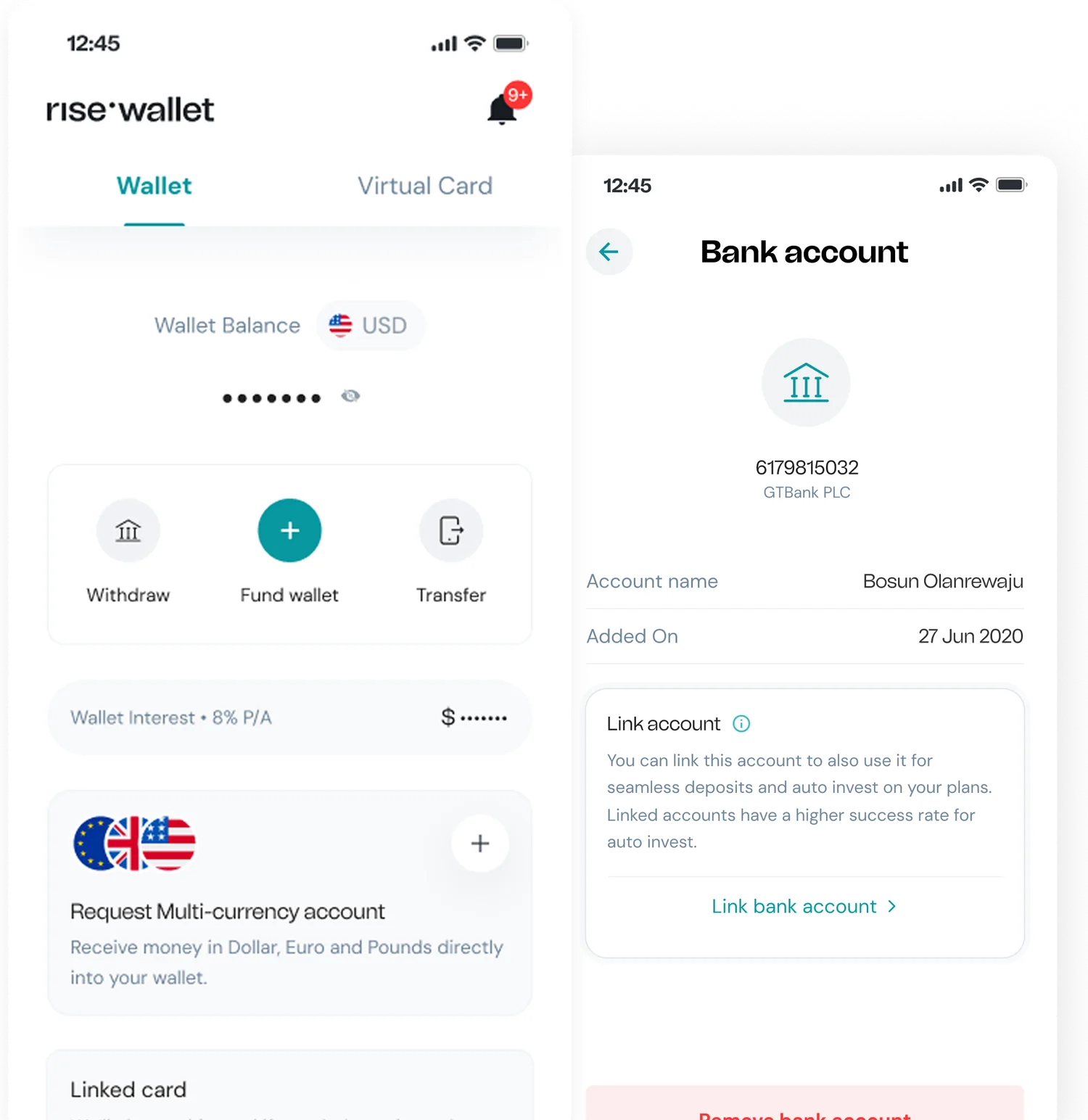
Rise multi-currency wallet and linked bank-account screens

Wallet & Banking

Designed the wallet flow, fund, withdraw, multi-currency accounts, linked cards. A critical trust moment: users need to feel safe moving money in and out.

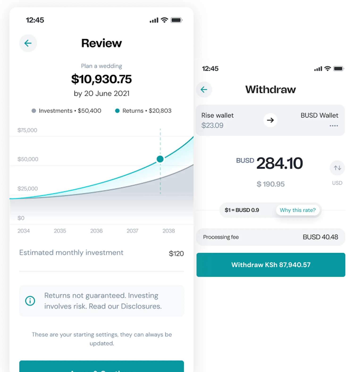
Rise plan review projection chart and currency withdrawal screen

Review & Withdrawals

Simplified review and withdrawal flows. Clear projections, transparent fees, and conversion rates visible before confirmation, no surprises.

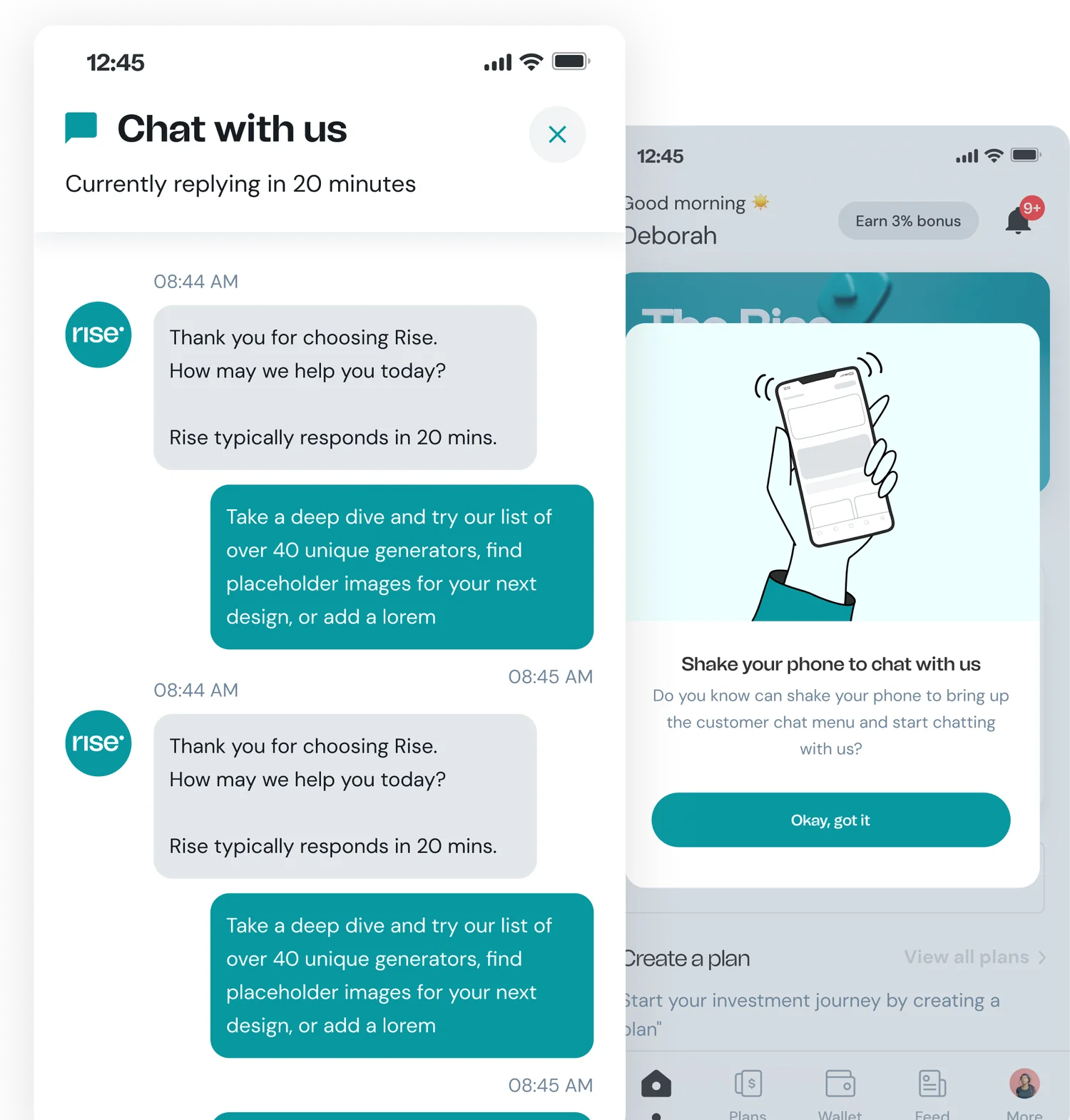
Rise in-app chat and shake-to-chat support screens

Support & Communication

Designed in-app chat and a playful “shake to chat” feature that made getting help effortless, reducing support-response friction by 40%.

Part 2, Deep Dive

simplifying the investment experience

The core challenge at Risevest was complexity. Users had money invested but the app made simple tasks hard: checking a balance took multiple taps, understanding a portfolio required mental math, and withdrawing money felt like navigating a maze. For a product managing people’s savings, friction isn’t just annoying, it’s dangerous.

The problem

Users had money invested but couldn’t understand their portfolio

  • Core actions took too many steps, checking balance, comparing plans, and withdrawing all required 4+ taps through confusing navigation.
  • Information architecture was flat, everything competed for attention on every screen.
  • Portfolio data was raw numbers without context, users couldn’t tell if investments were performing well without doing math.
  • Onboarding dropped 66% of users, the setup flow asked too much upfront without explaining why.

Research

Users struggled with complexity, not investing

  • Users wanted fewer steps, not more features. The most common interview request was “make it simpler.” They wanted to check a balance and leave in under 10 seconds.
  • Key tasks took too long. Checking portfolio performance took 4 taps and 22 seconds; withdrawing money took 6 taps across 3 screens. Both should be under 3 taps.
  • Competitor analysis revealed a UX gap. Apps like Cowrywise and Bamboo had simplified core flows. Risevest had more features but worse task completion, complexity scaled with every addition.
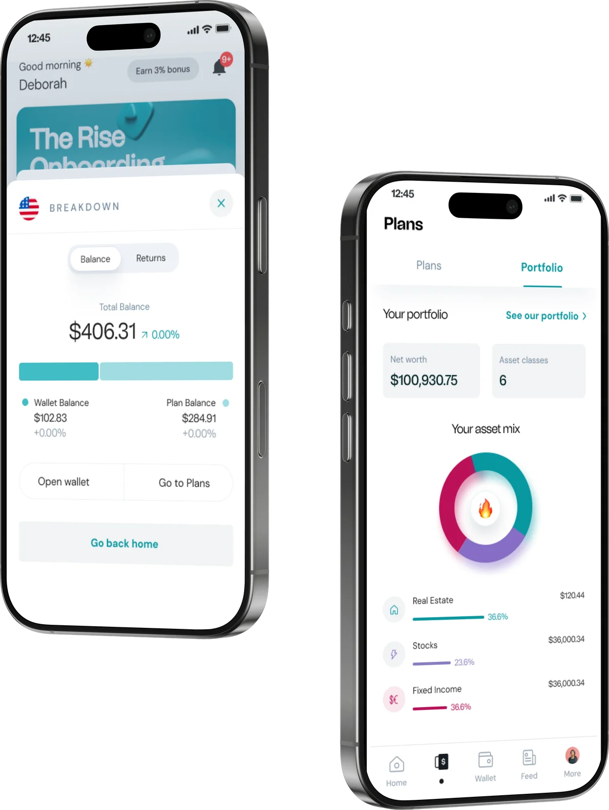
Rise redesigned balance breakdown and portfolio asset-mix screens

Key decisions & trade-offs

Decision 1

Simplified dashboard with progressive disclosure

Total balance and portfolio summary visible at a glance on the home screen. Drill into individual plans only when needed.

Why this, not the alternativesA card-per-investment layout tested poorly, users with 5+ plans couldn’t see their total position. The aggregated view with tap-to-expand gave the overview first, details on demand.

Decision 2

Color-coded portfolio visualization

Segmented donut charts with risk indicators. Each asset class gets a distinct color; tap any segment to drill into performance.

Why this, not the alternativesTables didn’t communicate risk intuitively, users couldn’t quickly compare allocation. Visual charts with color coding made composition immediately understandable, even for first-time investors.

Decision 3

Design system from scratch

Built a design system to enforce consistency and reduce cognitive load. Standardized patterns meant users learn one interaction and it works everywhere.

Why this, not the alternativesPatching individual screens would have been faster, but users would still face a different pattern on every page. A system-level approach made every screen behave predictably, learn one part, navigate all of it.

Before vs. after

Before
After
Inconsistent typography and spacing
Unified design system across all screens
Key metrics hidden behind taps
Portfolio at a glance on the home screen
No risk hierarchy or visual cues
Color-coded risk visualization
Low user-confidence scores
94% customer satisfaction
34% onboarding completion
58% onboarding completion
Rise redesigned plan, bank, wallet and matured-plan screens

Impact & results

620K+
Active users
94%
Customer satisfaction
34→58%
Onboarding completion
↓40%
Support friction

The redesigned app cut complexity at every level. Core tasks went from 4–6 taps to 1–2. Onboarding completion nearly doubled. Users reported feeling more in control, not because we added features, but because we removed friction from every interaction.

Reflection

The biggest lesson from Risevest: in fintech, simplicity is safety. Every extra tap, every confusing label, every screen that makes users think “wait, where am I?” erodes confidence. The design system was the most impactful decision because it made the whole app predictable, and predictable means trustworthy when you’re managing someone’s money.

If I did this again, I’d push for user testing earlier. We validated with internal stakeholders first, which biased toward feature completeness over task simplicity. Real users in front of prototypes in week 2 instead of week 6 would have caught the onboarding friction sooner.

Rise impact — 600k+ users, $42m+ paid out, 5 countries

Credits

Risevest Product Team

Product Management

Risevest Brand Team

Brand Design

Engineering

6 engineers